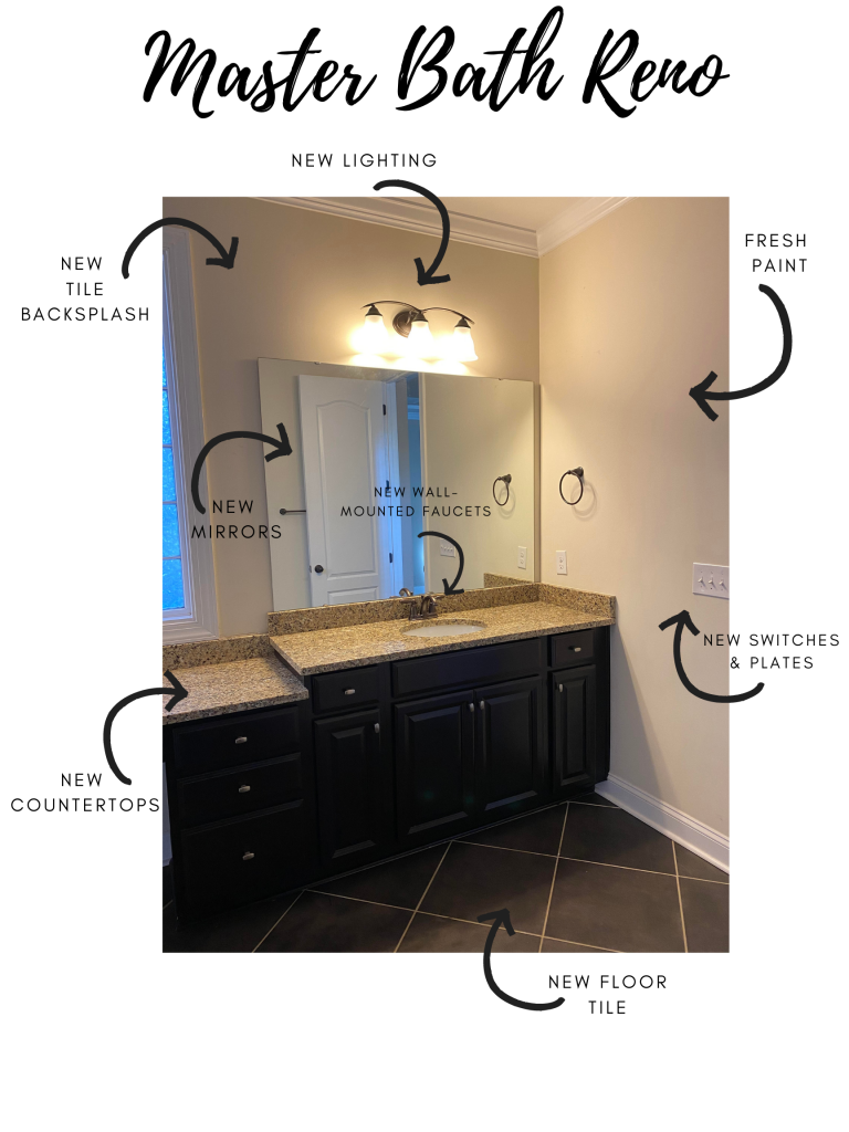
 Guys, big things are starting to happen at the house and I finally feel like I can see the light at the end of the renovation tunnel. It’s been a long 4 months so far, but we’re getting there. We’ve given ourselves a deadline of Christmas, so it’s time to really push through and get this baby finished. One of the biggest projects in phase 1 is the master bathroom. We’re almost doing a complete gut job, but before the reveal happens, I want to share the details for the master bathroom renovation plans that we’re tackling to change the look and feel of the space!
 First up, let’s talk about paint. If you read the post about the overall design direction we’re going with for the new house, you may have picked up the hints about paint colors.
The entire house is getting a fresh coat of white paint, which includes the master bathroom. We’re using Ultra Pure White by Behr. It will help to make the whole space feel bigger, cleaner, and brighter. The current paint color in the master bathroom casts a yellow dingy glow, which we don’t love, so the paint alone is really going to transform the space.
We’re also going to be painting all the doors in the house black! I really love the way black doors pop against white walls and think it gives everything a modern and sophisticated look. It’s daring, but in a classic way. For the black paint, we’re using Black in a semi-gloss by Behr.
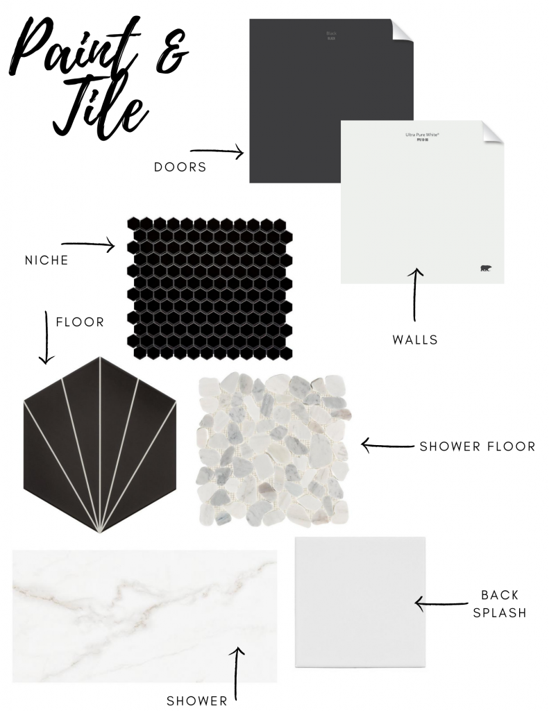
The master bathroom renovation plans include A LOT of tile. As you can see above, we picked 5 different samples to use in the new bathroom design alone.
We’re replacing the tile in the master bathroom shower with this matte porcelain tile. The color of the veining looks a bit more tan in the image above, but I’ll be pairing it with gray grout to pull out more of the gray tones. Porcelain tile is a great option to replicate the look of natural stone, like marble, for a fraction of the cost and maintenance. We did however splurge a bit on the marble countertops for the space! If you plan on selecting marble for your home, make sure you do some research about maintenance and upkeep. Not only is it more expensive, but it needs to be sealed every few years and can stain more easily than other options.
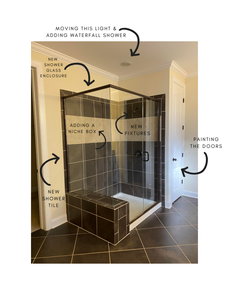
The current shower doesn’t have any shelves or a niche, so we’re adding one into the new shower. We’re tiling the entire niche with this 2″ black hexagon tile and pairing it with black grout to blend seamlessly. It’s going to really add a pop against the white shower tile too.
The shower floor is going to be laid with this Carrara marble pebble tile and will be finished with the same gray grout as the shower walls. I love this floor because it ties in a lot of the same colors we’re using throughout the master bathroom renovation plans.
For the master bathroom floor, we’re going with something that’s more fun and very graphic. I originally fell in love with a cement encaustic tile that looked very similar to the one above, but after doing a lot of research we decided that cement tile wasn’t a great choice for us in the bathroom because of excess water. We also know that cement tile also needs regular maintenance and we didn’t want to have to worry about that. When I found this porcelain option (for under $3 a square foot) I jumped on it. I can’t wait to share the finished product with you guys once the pattern is all laid out!
Last, but not least, we decided to add a fully tiled backsplash wall behind the sinks, where the existing mirrors were. I don’t want to detract from everything else going on in the bathroom or make things look too busy, so I picked this simple white tile to use. To add a little bit of visual interest, I picked a square instead of a traditional rectangle shape. It’s going to look so great once the new fixtures are installed, which you can read more about below!
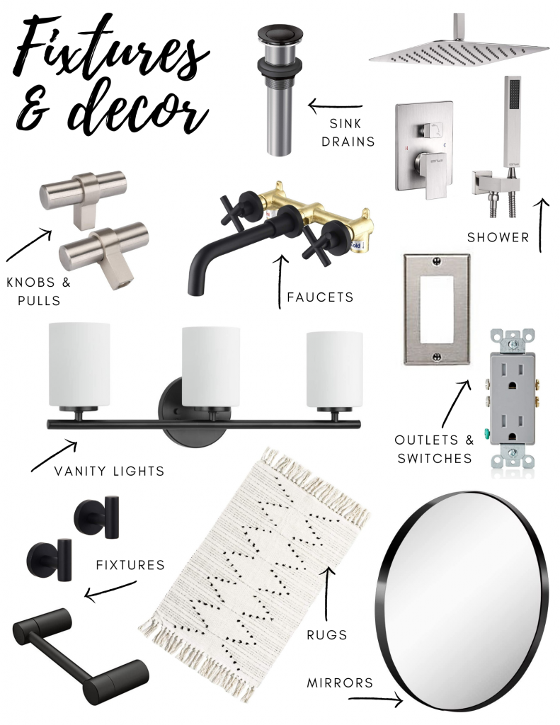
For the fixtures in this space, I really liked the idea of mixing finishes, which actually happened by accident.
I fell in love with the idea of adding wall-mounted faucets and knew that I wanted them to be black for the master bath. But I couldn’t find a waterfall shower head that matched without it costing a million and a half dollars. Josh has been talking about waterfall showers ever since we took a trip to Thailand and it was a big thing on his “wants” list for a new house, so I knew we definitely had to include that in the bathroom remodel. I compromised on the color and found this one that was brushed nickel, but tied in some black details in the handheld shower faceplate and the silicone tips on the shower head.
These are the wall-mounted faucets we’re going with for the master bathroom renovation plans. Their only downside is that they don’t come with a matching drain, so I found these pop-up drains to use, which match perfectly. (The gold you see in the photo above will be hidden inside the wall).
Our original plan was to keep all of the existing cabinetry to help us stay within our budget. I’m hoping that once everything is installed, the color and tone of the cabinets will pull more black than brown, so I may end up having to paint them depending on what happens, but regardless, we’ll be changing out the current knobs to these brushed nickel ones.
I haven’t completely decided exactly which fixtures we’re going to add to the new space, but I did narrow it down to this toiler paper holder and I love these hooks for towels too.
Another small change that packs a punch is light switches, electrical outlets, and switch plates. They’re things that most people don’t even notice, but when you upgrade them, they really add a luxe and high end look. I switched them all out in my last house and it made a big impact. We’ll be changing all of the electrical outlets and light switches to gray ones from Leviton and we’re replacing all of the switch plates with stainless steel ones from Leviton too.
We’re switching out the existing vanity lights for these ones, which fit perfectly above these new round mirrors we’ll be hanging up once the tile backsplash is installed. Josh isn’t a huge fan of the mirrors, but I know he’ll come around.
Another thing he’s not a fan of….tassels. I never knew that a guy could be so opposed to tassels on a bathroom rug, but he’s determined to hate these ones. I told him I’d order them to “try” them in the space and if they don’t work, we’ll send them back. I’m hoping he realizes they’re perfect once they’re in place, because there is a matching runner that would fit perfectly in front of the shower too 😉
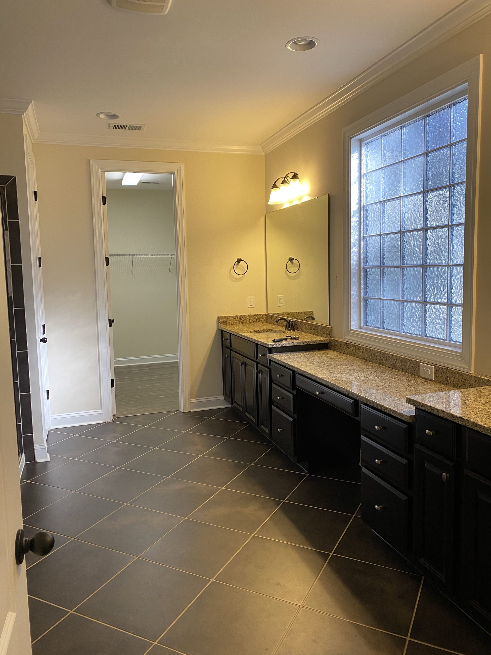
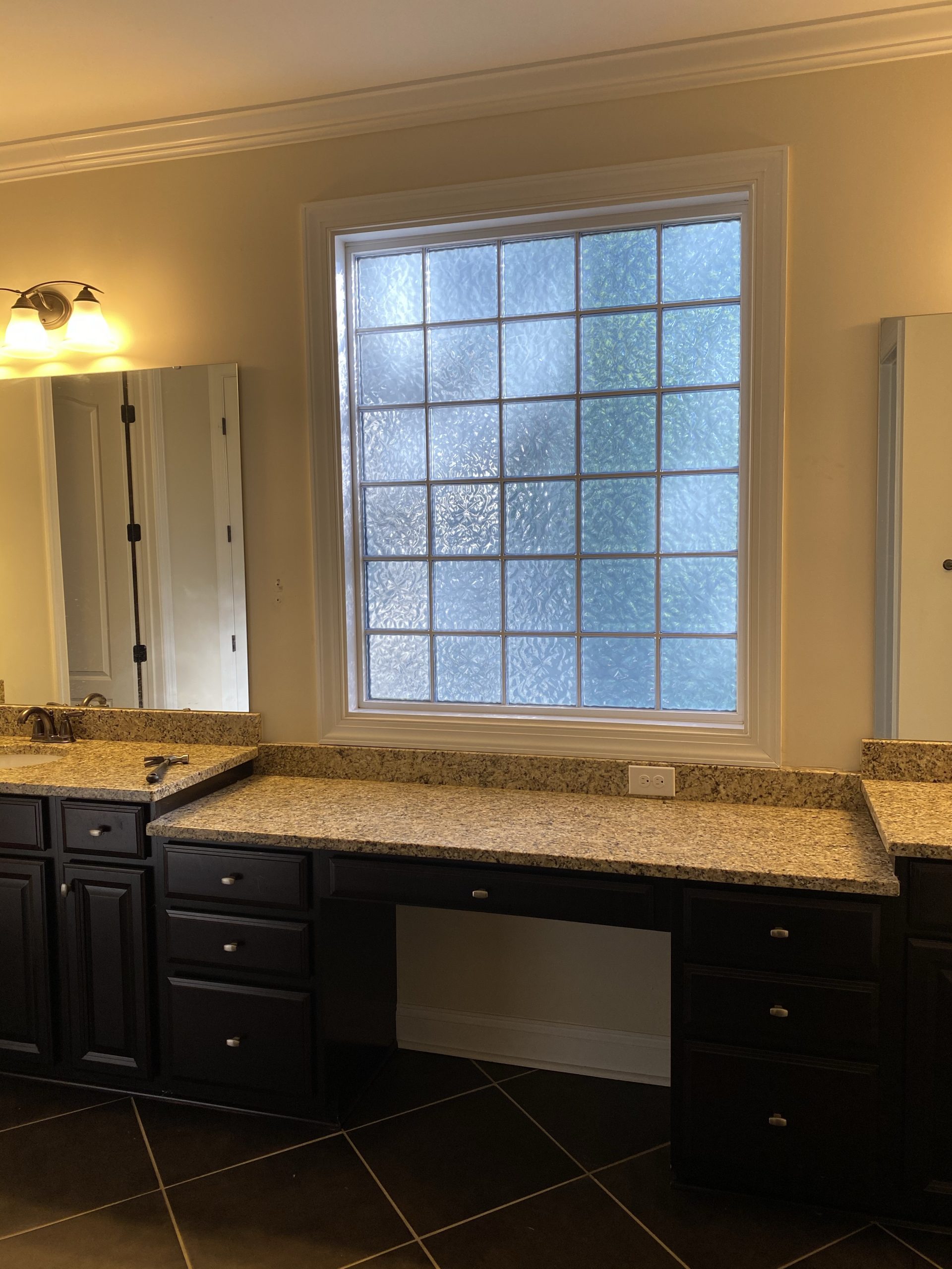
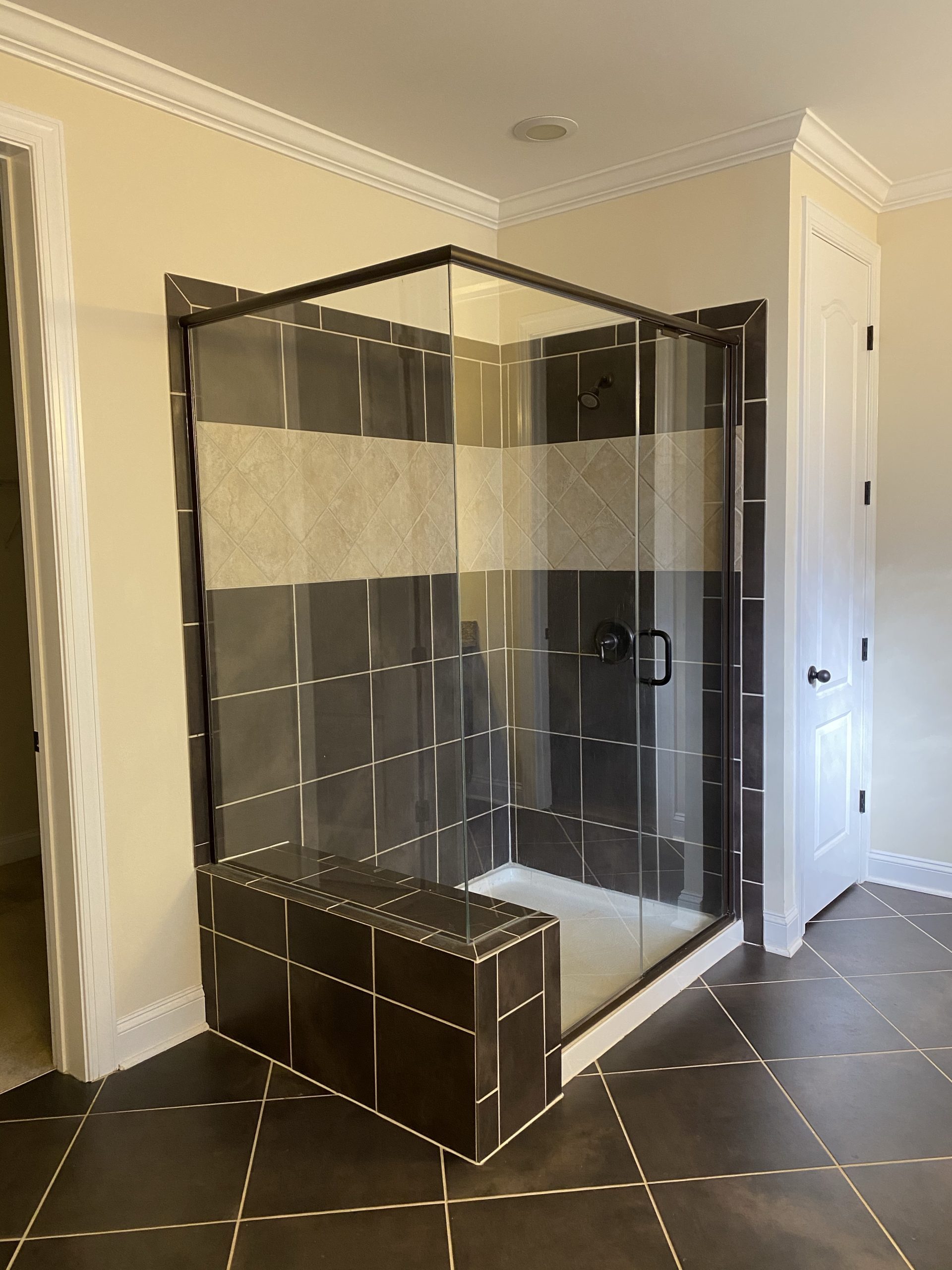
And just to give you guys another reminder, here is what the current master bathroom looks like now.
 Can you guys see my vision?
I can’t wait to share some sneak peeks over on Instagram stories as things start to take shape in here, and the full reveal once everything with these master bathroom renovation plans is done!
