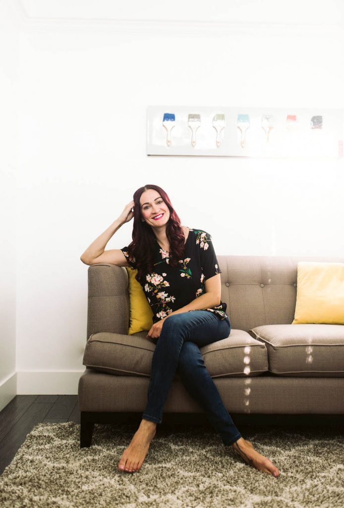
 This post has been a LONG time coming and, true to form, I waited until the very last minute to share it with you guys. Buuuuut, at least it’s getting done, right? I had this house built back in 2004 and it’s been home ever since. I’ve been adding finishing touches here and there, ever since I renovated it in 2016 (see the kitchen before photo below…yikes), but I never really felt like it was ever quite done, and honestly, I don’t know if you ever actually reach that point in a house. It seems like something is always a work in progress or I’m constantly searching for “the perfect” item to display on a shelf or hang on a wall. But, regardless, finishing the house was part of my 2019 goal list and I was determined to get it done! Annnnnnd then life had some unexpected surprises in store for me, like moving to North Carolina! So in a few weeks, I’ll be packing everything up and starting over across the country, but I still wanted to share my Utah house tour with you guys before I go! Also, fair warning…this is a loooooong post!
The moving boxes are in the garage, the bubble wrap is piling up, and I’ll have already started packing by the time you guys are reading this, but this house has always been such a fun decorating project for me and one that I’ve loved. I truly believe that your house should be an extension of your personality and a place where you can really be yourself, regardless of trends, fads, or what someone else will think about it. Hopefully you guys can get a little peek into my personality by taking a walk through my Utah house tour with me!
For the renovation, I only made cosmetic updates to the house. I did toy with the idea of taking down walls, changing the plumbing, and completely transforming the layout of the space, but overall, I chose to stick to the bones of the house and updated what I could without having to get additional permits and approval. And, of course, there are still things I had plans to do and never got around to doing, but I’m still thrilled with how everything turned out.
The Kitchen/Dining Space –
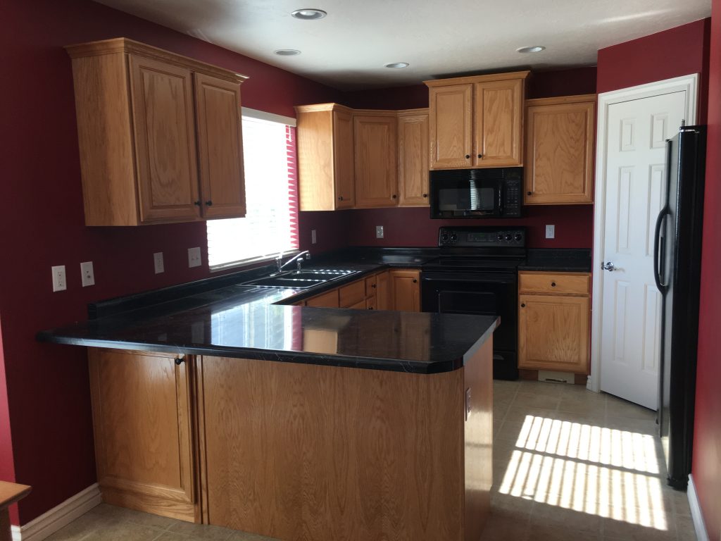 The Kitchen Before
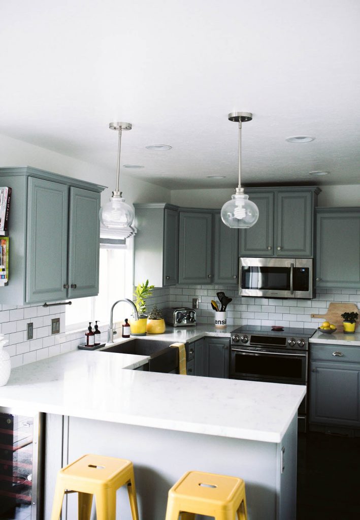 In my opinion, the kitchen had one of the biggest transformations. Check out that before photo! Who thought red walls and a black counter top were a good idea?! (Yeah, I’m not about to admit that I picked those things when I built the house originally).
 I chose to stick with the original cabinetry to save money, but had them painted in the color Gray Matters, by Sherwin-Williams.
I also loved the look of marble counter tops, but after looking into them I decided they didn’t make the most sense for my lifestyle. I didn’t want to worry about staining them or having to refinish them every few years, so I picked out a Quartz counter top that resembled that same marble look instead. It’s been SO easy to clean and take care of and I don’t worry about stains at all! Plus, the Quartz price tag was much friendlier on my bank account.
I added a traditional subway tile back splash to the kitchen, but made the whole thing a bit more modern and stand out more by selecting a dark grout to make each tile pop. I used these tiles from Bedrosians Tile & Stone.
I picked out these knobs and these drawer pulls from Ferguson.
I researched appliances for awhile and ultimately went with Samsung appliances for the kitchen, because they had the COOLEST features. (You can see what I mean over on the “My Utah House Tour” highlight on my IG stories). This oven is great because it gives you the functionality of a double oven, without needing the space for two. It’s also soooo handy because you can control it with an app on your phone, so you can have it preheated and ready for dinner before you walk through the door!
The fridge is also a FAVE of mine. It has a showcase door, which opens two different ways so you can quickly grab items you use regularly, like creamer or ketchup, without having to open the whole fridge to get them. The stainless steel is also fingerprint resistant and the shelves are completely adjustable.
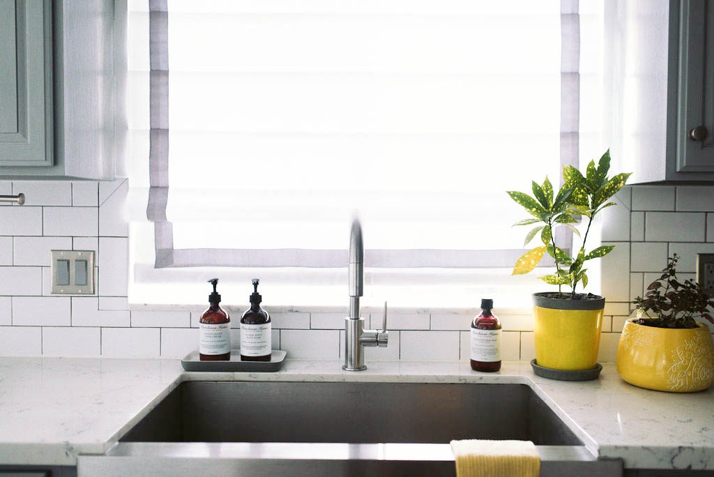 I ripped out that hideous black sink I previously had in my kitchen and replaced it with this one from Kohler. I’ve loved this sink and the insert that comes with it SO much. (You can see a peek of it on the My Utah House Tour highlight on my IG stories). It was a really simple thing that totally transformed the kitchen.
Anytime I post a photo of my sink I always get questions about the faucet. Who knew it would be so popular, ha. I selected this Delta faucet for the clean and streamlined design, that fit in perfectly with the space.
I worked with Ferguson to pick out a lot of the fixtures and finishes (including the sink and faucet) in the renovation and they made things sooooo easy, plus they shipped EVERYTHING right to my house on a palette, which was a dream.
I replaced my existing blind in the kitchen with this roman shade that I customized. They make them in the exact size to fit your window and you can pick everything from the color, to the style of mount, type of lift option, type of fold, liner, and accent options too. I chose a shade in the color Wales White, with an inside mount, white lining, a plain fold, cordless lift, and the Pewter ribbon trim.
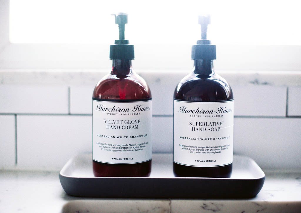
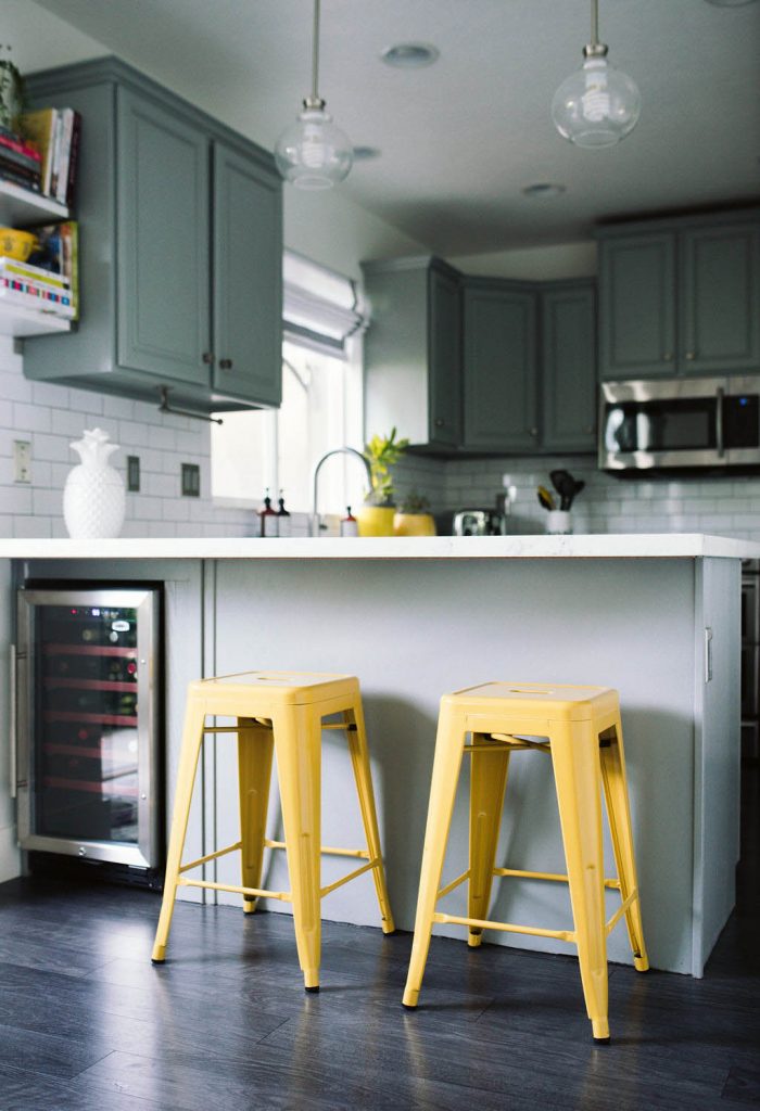 I had an awkward cupboard (that I never used) on the back side of my kitchen island, so I ripped it out, with my dads help (thank’s dad!), and used that space to put in a wine fridge instead. It’s so much more functional now! If you decide to do it, make sure you find a wine fridge that fits the dimensions of your space.
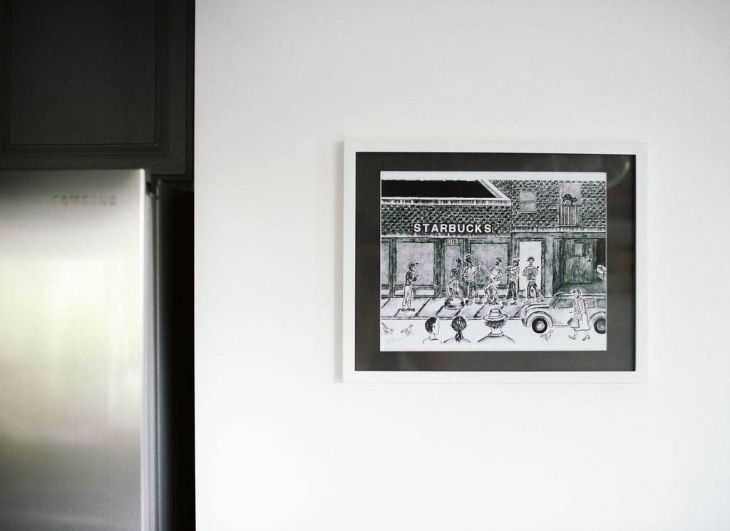 One trend that you guys will start to notice in my house, is that I LOVE original art. Buying an original art piece was always on my bucket list, so when I moved forward with this renovation, I made sure to include art into the plans. I like to purchase original art from a lot of different places, but I especially love to snag some when I travel! This drawing was purchased from a street vendor in Seattle on a past trip.
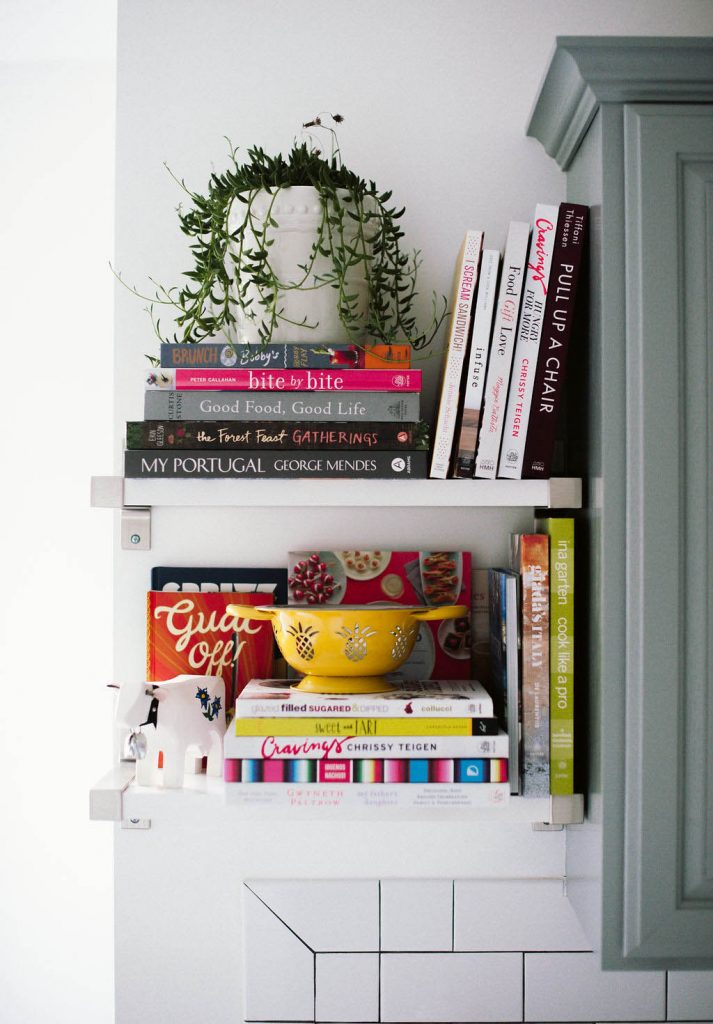 I added these Ikea shelves and brackets so that I’d have an area to store some of my favorite cookbooks. These shelves are great because you can cut them to fit the exact space that you need and the silver brackets still look clean and modern, which I love.
[show_shopthepost_widget id=”3698519″]
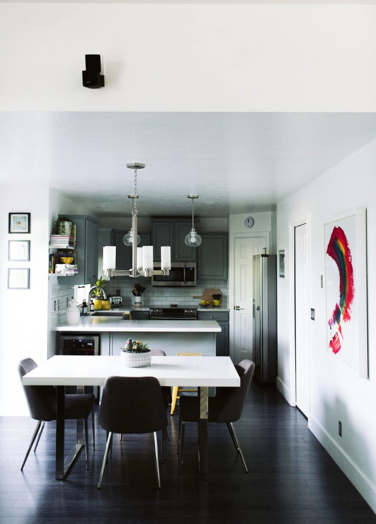 The dining area is basically just an extension of my kitchen, so I tried to keep things very similar in both areas.
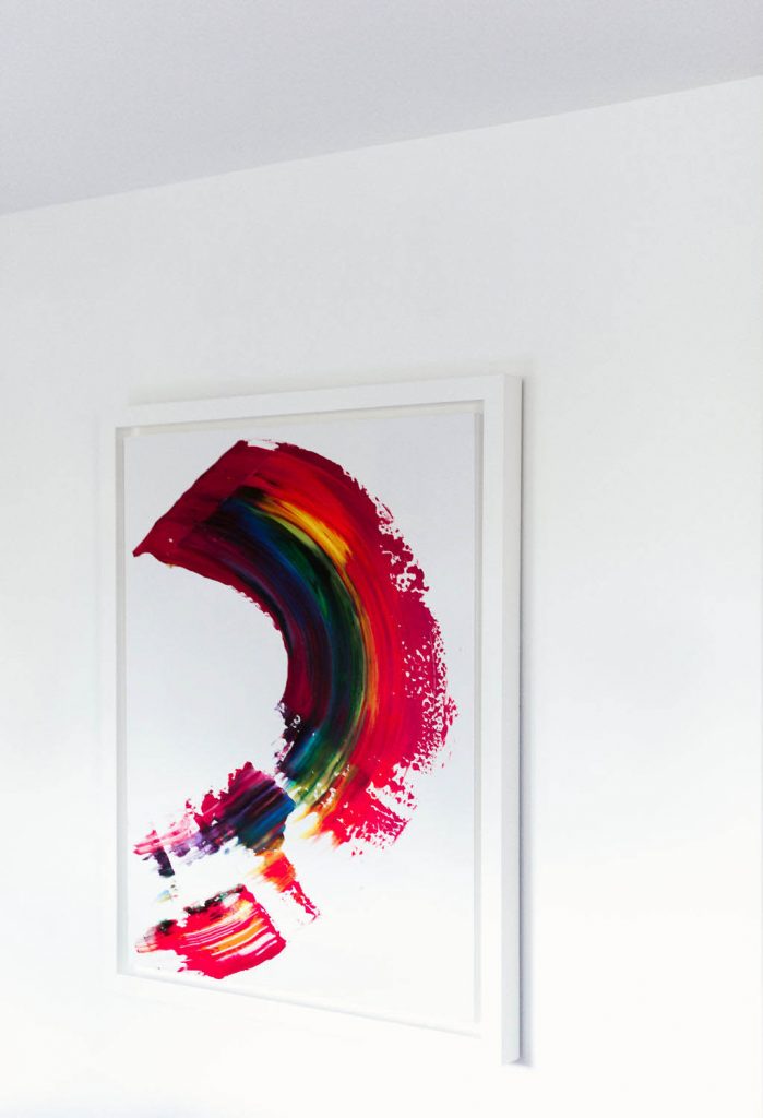 One of my bigger art pieces is featured in this space. As soon as I saw this piece from Pamela Nielsen, I knew it was destined for this wall. I love the bold pop of color it adds to the room. Also, walking through Pamela’s home and art space was a contemporary art lover’s dream. She has so many amazing pieces!
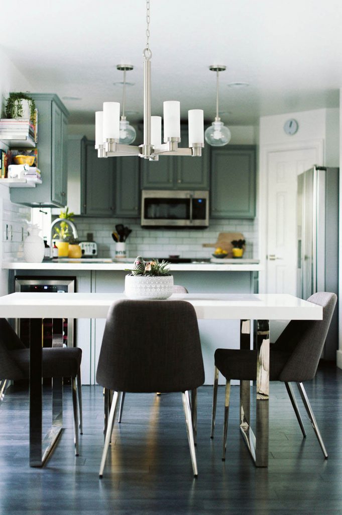 This light fixture was also selected through Ferguson and matches the chandelier in my entry way.
These chairs from Wayfair are still a FAVE of mine and I’m so sad that I’m not keeping them for the new Charlotte house. They are a little bit retro, but still modern, and are oh, so, cozy.
The table is from All Modern and is also a total win in this space!
I ripped out all of the old carpet and vinyl flooring throughout the house and replaced it with the 12mm Flint Creek Oak laminate flooring from Lumbar Liquidators. I have a dog, so going with laminate seemed like the smartest choice for both cost and durability. (The color I selected isn’t available anymore, but this option is very similar!)
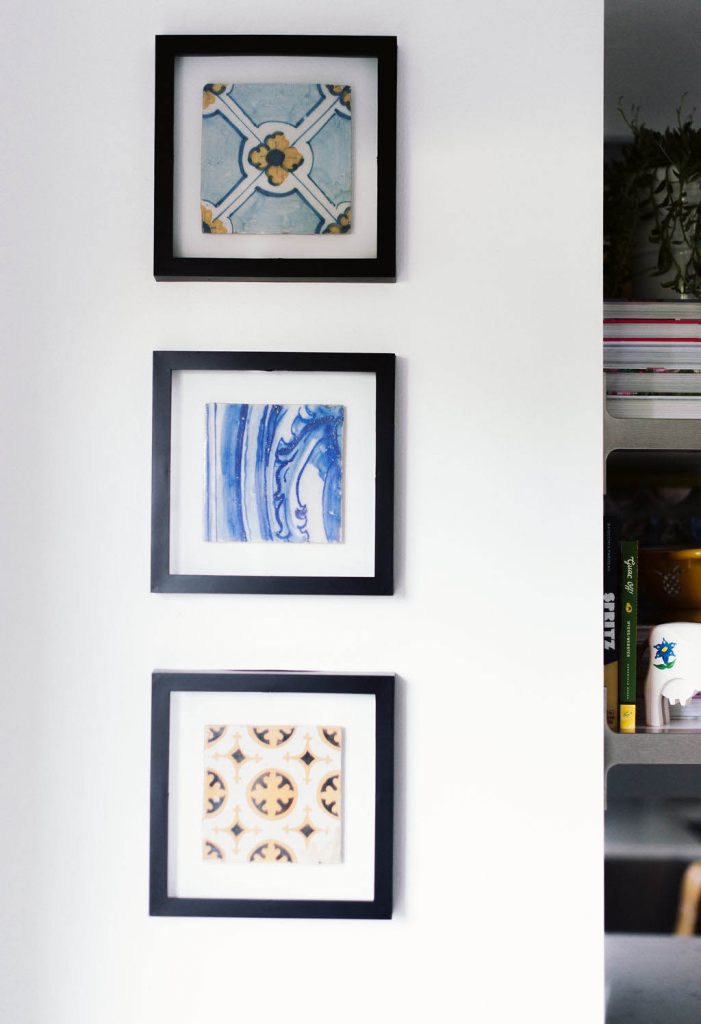 I picked up these vintage tiles on a trip to Portugal a few years ago. I had them framed and mounted by the staff at Michaels. I especially love that there are chips and imperfections in them, adding to their story.
(Don’t sleep on Michael’s for framing. They usually have great coupons available and always do an awesome job! I’ve used them many times to frame my art.)
Family Room –
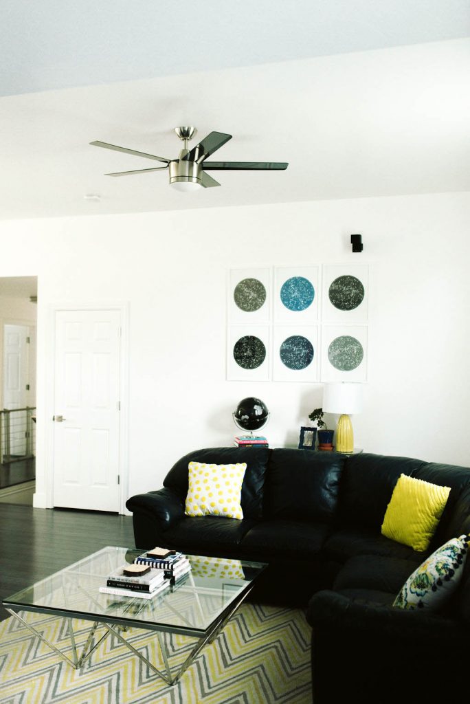 The family room is another area where I spend a lot of my time. Nights with my girlfriends usually end curled up on this couch with some drinks, and we’ve been known to watch a few Harry Potter movies in this room too! 😉
You can’t tell from the photo, but I have a Sonos Play:1 speaker in this room that I love! I pair it up with the other Sonos speakers that I have in the house, using an app on my phone, to create a full surround sound system throughout the space without having to wire anything extra. I can connect my Spotify account to my app and listen to all of my playlists and saved songs. It’s awesome for entertaining or when I want to lay on the couch to chill and listen to a podcast.
I was on the hunt for the PERFECT white paint to use in the house, and if you’ve ever done it, you know how difficult that is. Most white paints have a lot of eggshell, cream, blue, or beige tones in them, but I wanted the whitest true white I could find. And I’m happy to report that I successfully accomplished it! The white paint that I used is called High Reflective White from Sherwin-Williams. It’s perfect and made all of my white house dreams come true.
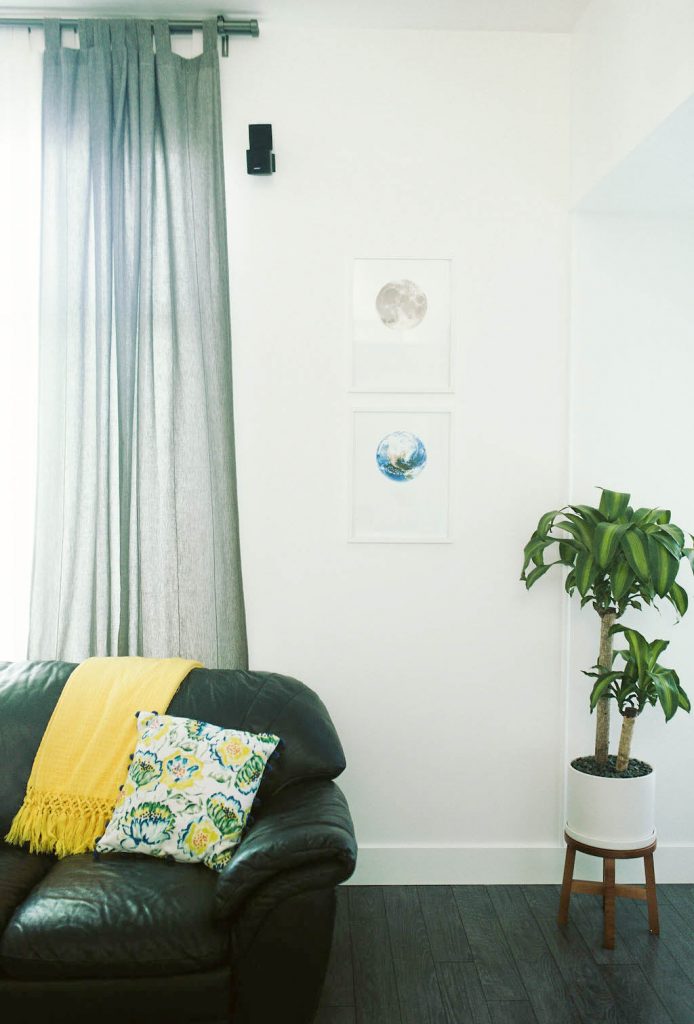
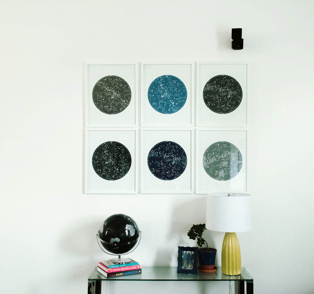 Another great place that I like to purchase art is Etsy. I picked out these prints for the wall and created a grid type of gallery.
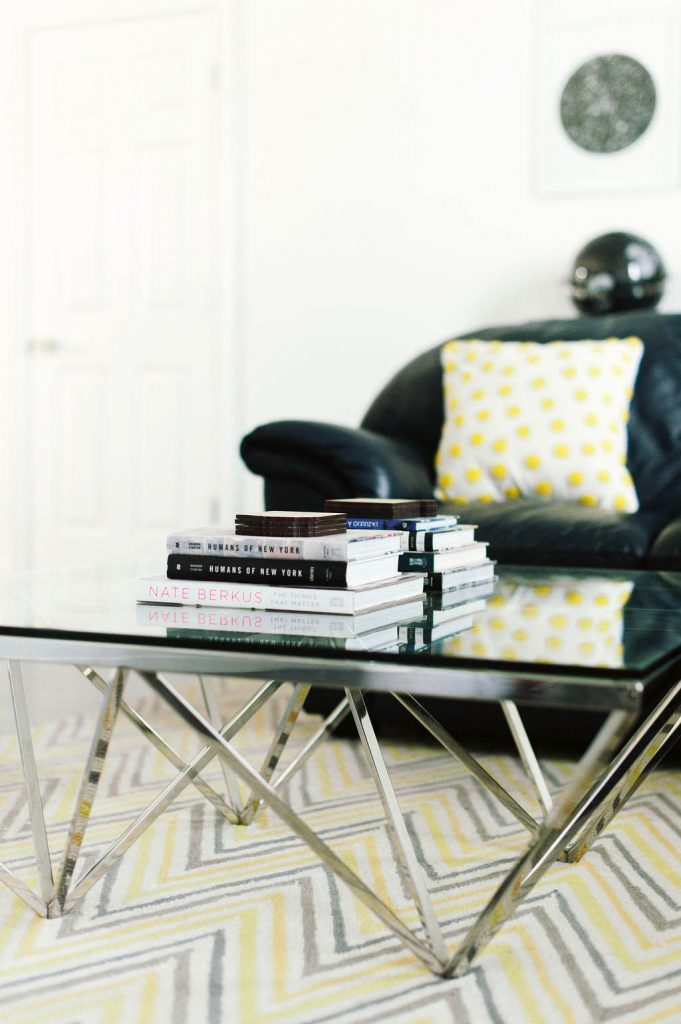 I think I’m addicted to coffee table books. They’re so inspiring and I try to find places to add them all over my house.
The coffee table and the side table that sits below the gallery wall, were both found at Homegoods.
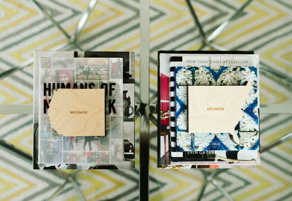
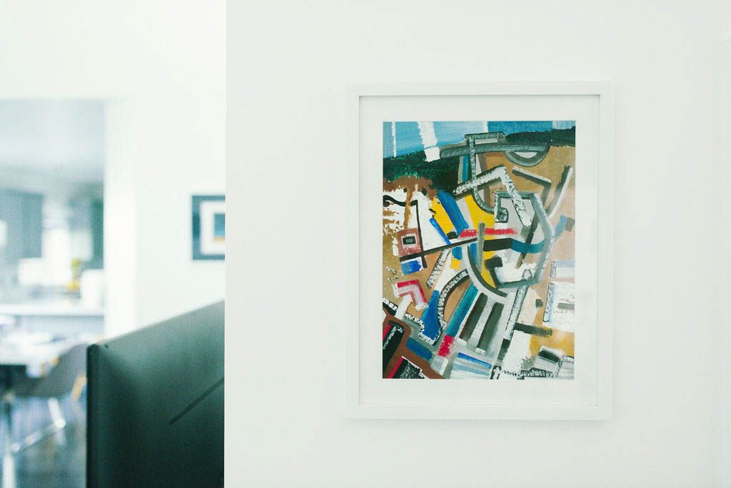 Original art is by Ulugbek Doschanov.
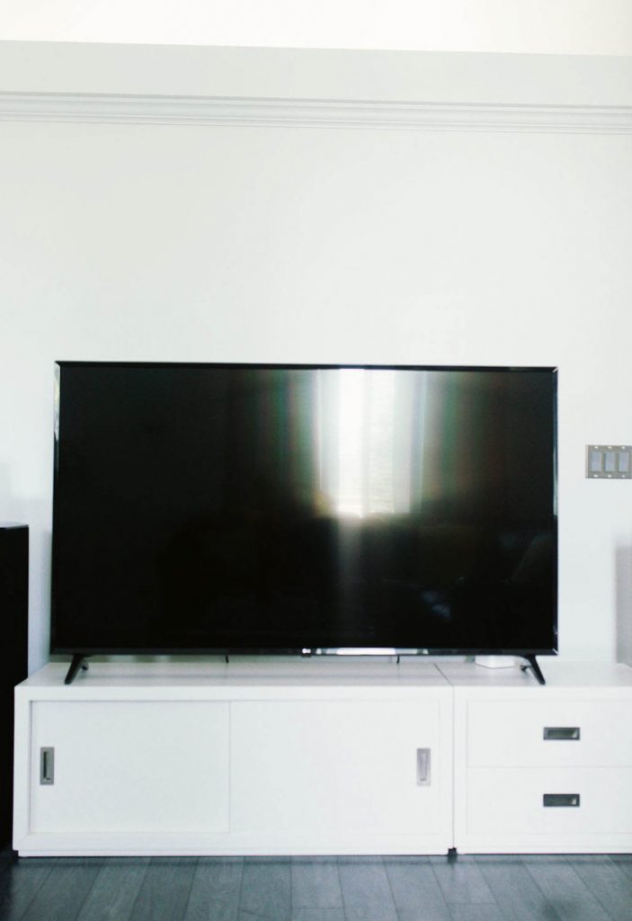 I know that pictures of a tv are boring, but I wanted to share this collection of media center pieces that I picked out at Crate & Barrel. Each item can be purchased separately, so you can create a media unit that works perfectly for your specific set up. Plus, they’re clean, modern, and come in multiple colors too. I linked the exact pieces that I used below.
[show_shopthepost_widget id=”3698522″]
Front Entry/Hallway –
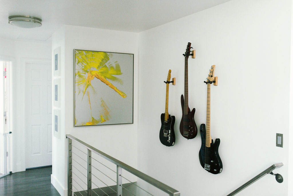 Before, the hallway was just a boring space, but I added more visual interest by ripping out the old wooden banister and replacing it with a custom stainless steel and cable banister. It completely changed the look of the area and made it another focal point in the house. I added these light fixtures to match the banister.
You can also see a few sneak peeks of the new gray electrical switches and stainless steel switch plates that I upgraded throughout the house. I purchased them here and used the Leviton gray light switches and electrical outlets and the Leviton stainless steel wall plates.
My biggest art piece in the house is another Pamela Nielson original. It’s painted on metal and I love the pop of bright color it adds.
The guitars were originally owned by my late husband who passed away. I wanted to display them in a unique way, and I think they make me look pretty cool too. 😉 I used these hooks to hang them up and they have been great.
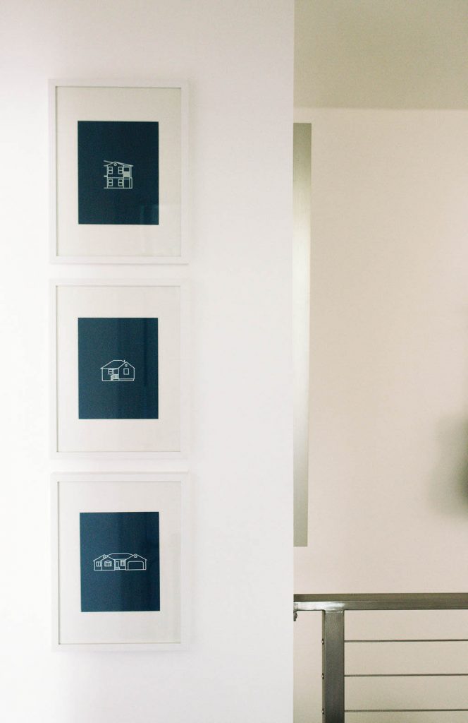 If you’ve hung around the blog for awhile, you know that I regularly share fun printables. Katie, my right hand design woman, is the person who helps me bring those printables to life. She also created these custom prints for me. They are “blueprint” like designs of every spot that I’ve lived in thus far, from my first apartment, to my first home rental, and to my current house now. I can’t wait to have her design the next one for the new Charlotte house!
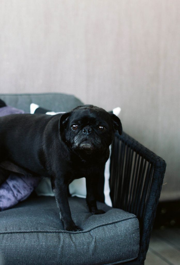
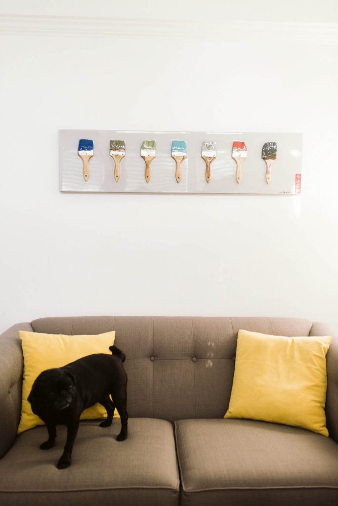 Sophie couldn’t go very long without making an appearance in my Utah house tour. This also happens to be one of her favorite couches to nap on.
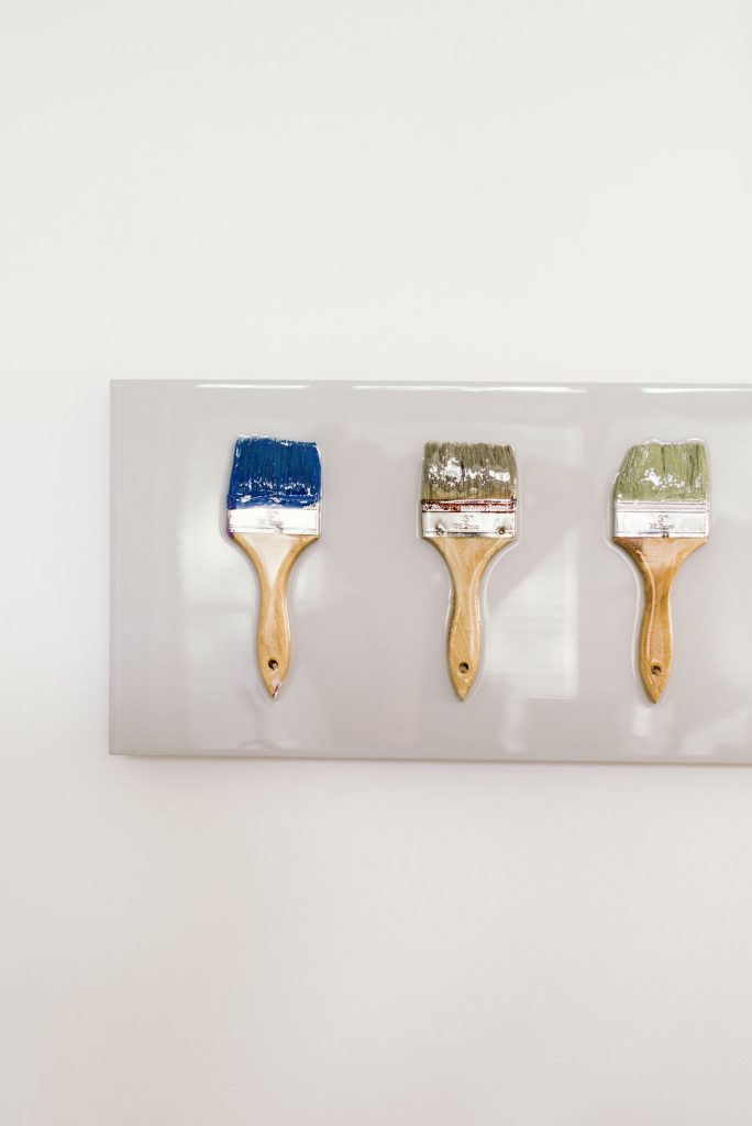 This is another piece of original art that I picked up on a trip. I was attending a San Francisco jazz festival and saw this piece that a street artist was selling. The piece was made using actual paint brushes that he had used to make previous work. I scooped it up immediately and it found a place on the wall in my front room.
[show_shopthepost_widget id=”3698502″]
Spare Bedroom –
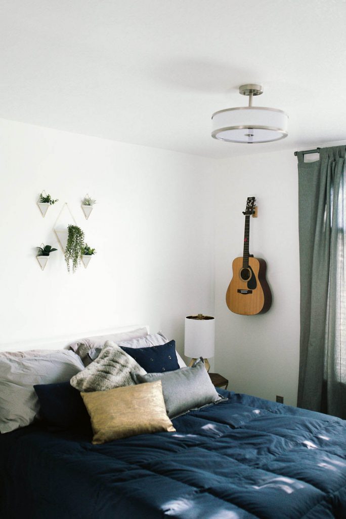 When I have friends spend the night, I wanted to make sure that the spare bedroom felt mellow and cozy.
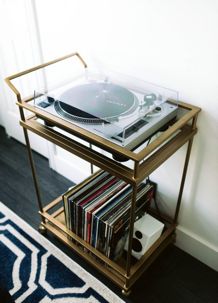 I had been looking for a place to store my record player and record collection, and decided to use a bar cart for a unique and fun touch. Who needs drinks when you’ve got records?
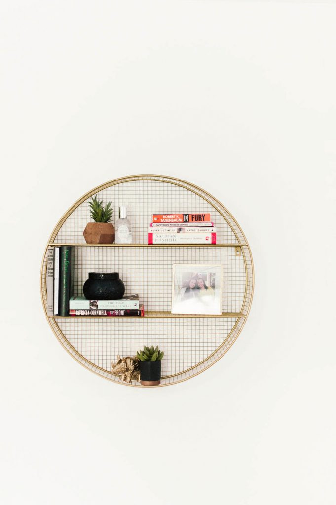 Styling a round shelf is a bit trickier than a normal shelf, but I didn’t let it deter me when I picked this one out. Also, don’t forget to check the kids section of your fave stores. That’s where I snagged this shelf for the room!
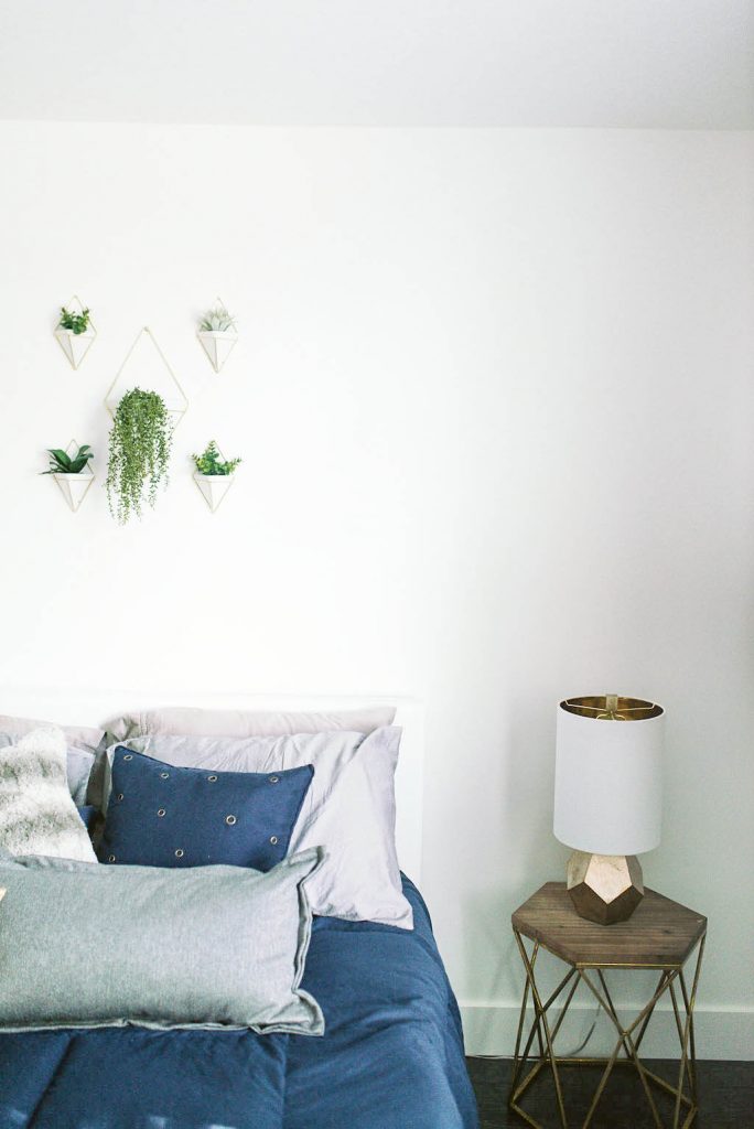 The room is filled with fun shapes and details like the ones found on the side tables, lamps, and hanging wall vases. (I can’t find the exact table lamps I bought, but I linked a similar shape and color that would be amazing below!)
[show_shopthepost_widget id=”3698508″]
Office –
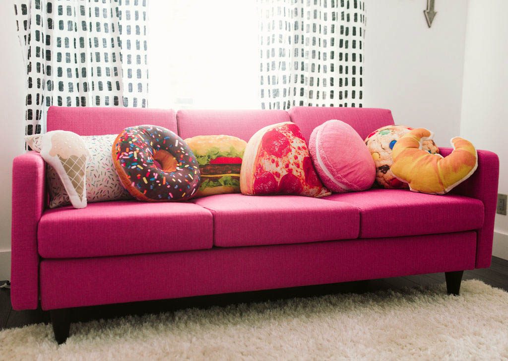
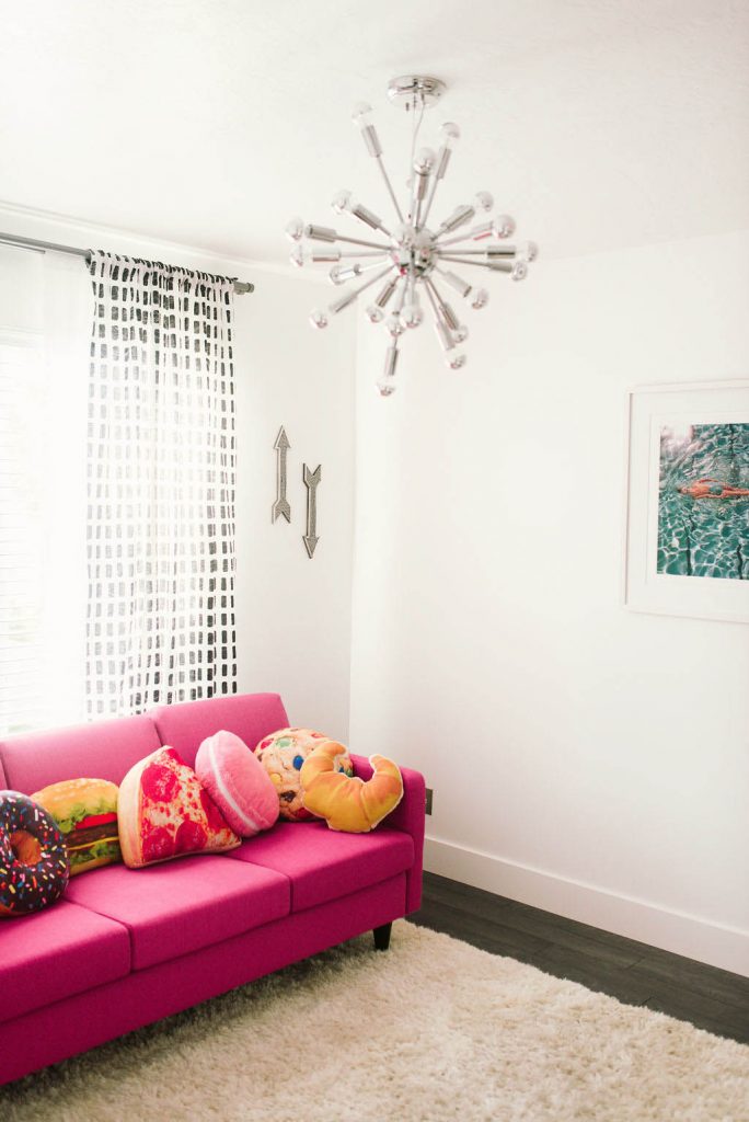 This pink couch was the very first thing I picked out for my office. It’s bight and I love it. The couch has famously also been dubbed the “carb couch” because of the pillows I picked out for the space. If you know me, you know I looooove me some carbs.
The lighting fixture is from All Modern and is linked below.
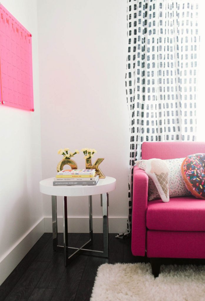 I found these curtains on Cb2 and love the graphic pop they add to the room without being too much. The side table is an Overstock find (linked a similar one below) and the “OK vase” is from a past Oh, Joy for Target collab.
Once again, coffee table books found a home in this room too.
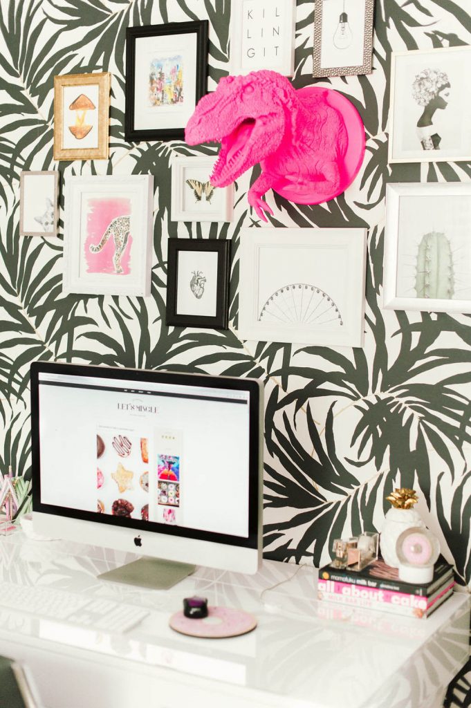
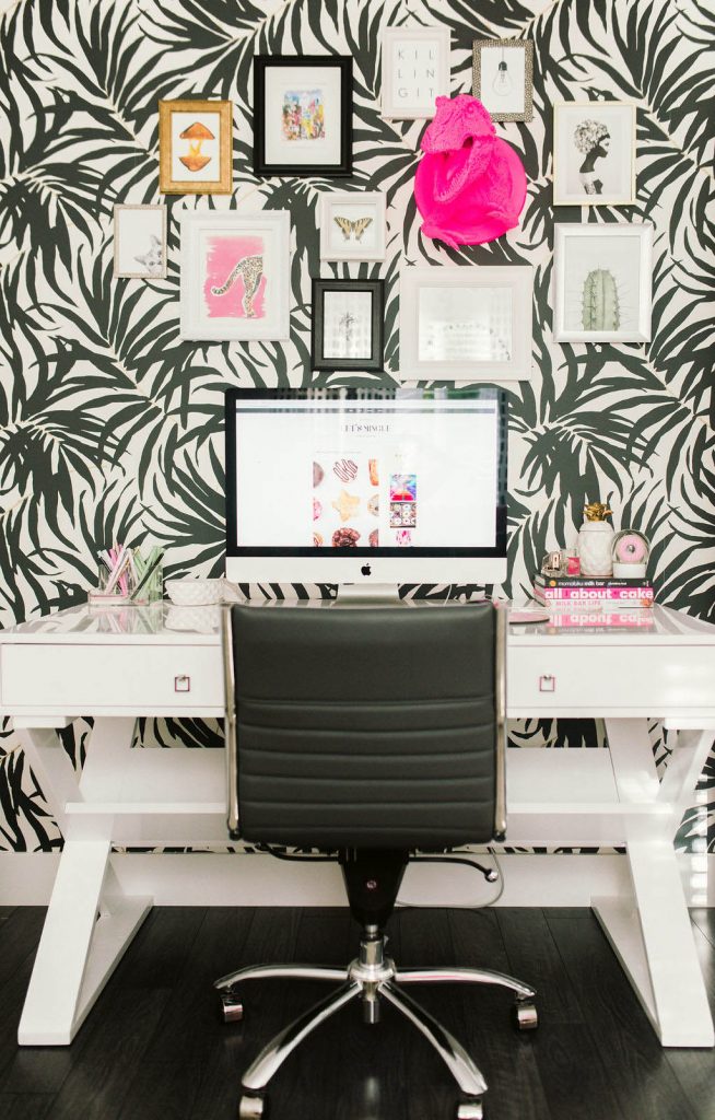 This gallery wall has sparked a lot of conversation, mostly because of my fuchsia T-Rex taxidermy style wall mount. He was another Etsy find and the store owner sells SO many other cool faux wall mounts as well. (You can check out the other prints that I used on my gallery wall below).
If you didn’t know, Anthrolopogie has some AWESOME wallpaper. I’m already dreaming about which ones to use in the new house, but I picked this one for my office space. It has little gold details throughout the paper and adds a really graphic pop behind the white desk that I picked out from Z Gallerie.
[show_shopthepost_widget id=”3698512″]
Spare Bathroom –
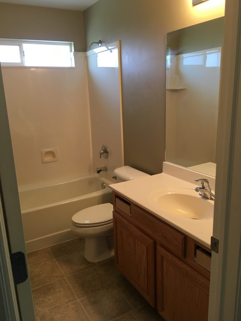 The Spare Bathroom Before
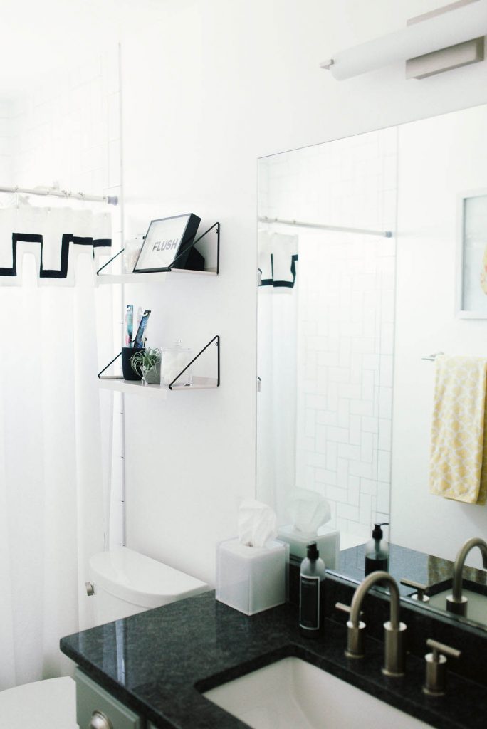 If you haven’t been able to spot the trend happening on my Utah house tour yet, this bathroom might clue you in to the black and white graphic elements I like to use, along with fun pops of color.
Light fixture is George Kovacs. Faucet is Pfister.
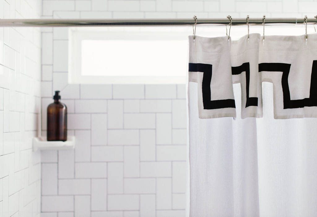 I took a cue from the kitchen and used the same Bedrosians Traditions Ice White 3×6 subway tiles that I used for the back splash, but switched them up into a different pattern for a modern twist. I used dark grout again to really make the design pop.
The shower curtain is from an older Jonathan Adler collection.
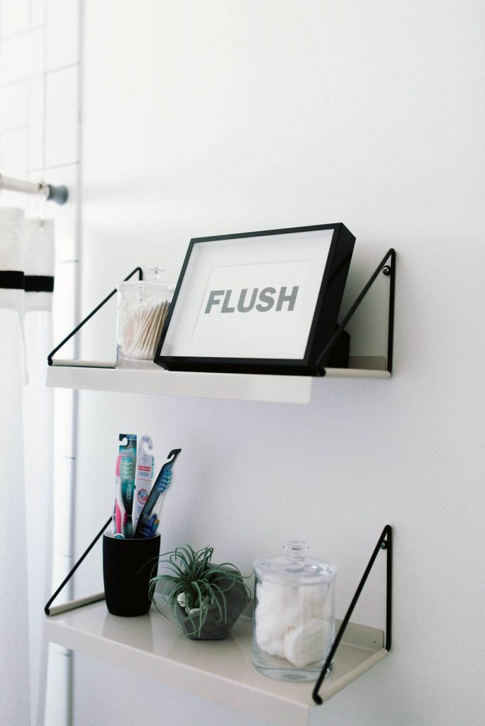 Another great place to find home decor is Urban Outfitters, which is where I found these shelves for under $30. I styled them using glass jars filled with cotton pads and q-tips, plus I always like to leave out new toothbrushes, just in case a guest needs to sleepover or forgets to bring one when visiting from out of town.
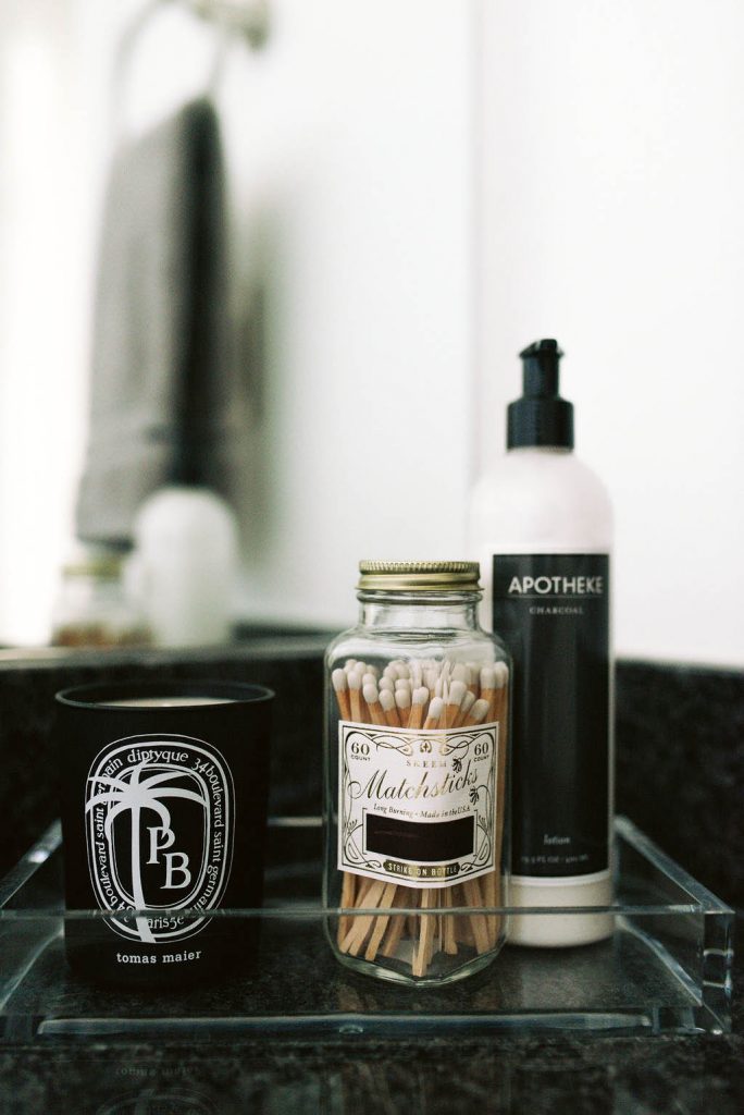 Diptyque is one of my VERY favorite candle companies and the fact that this collab with Tomas Maier matched the bathroom was a win win! Black charcoal soap and the hand lotion are from Apotheke. The vintage matchstick bottle is from Skeem Design.
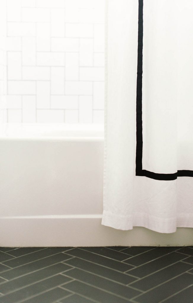 For the flooring, I picked these Costa Allegra 3×12 tiles in the color Riverway, from Bedrosians. I had them laid in a herringbone pattern, which gave the room such a modern and sophisticated vibe. (You can see more of the flooring on the “My Utah House Tour” highlight on my IG stories).
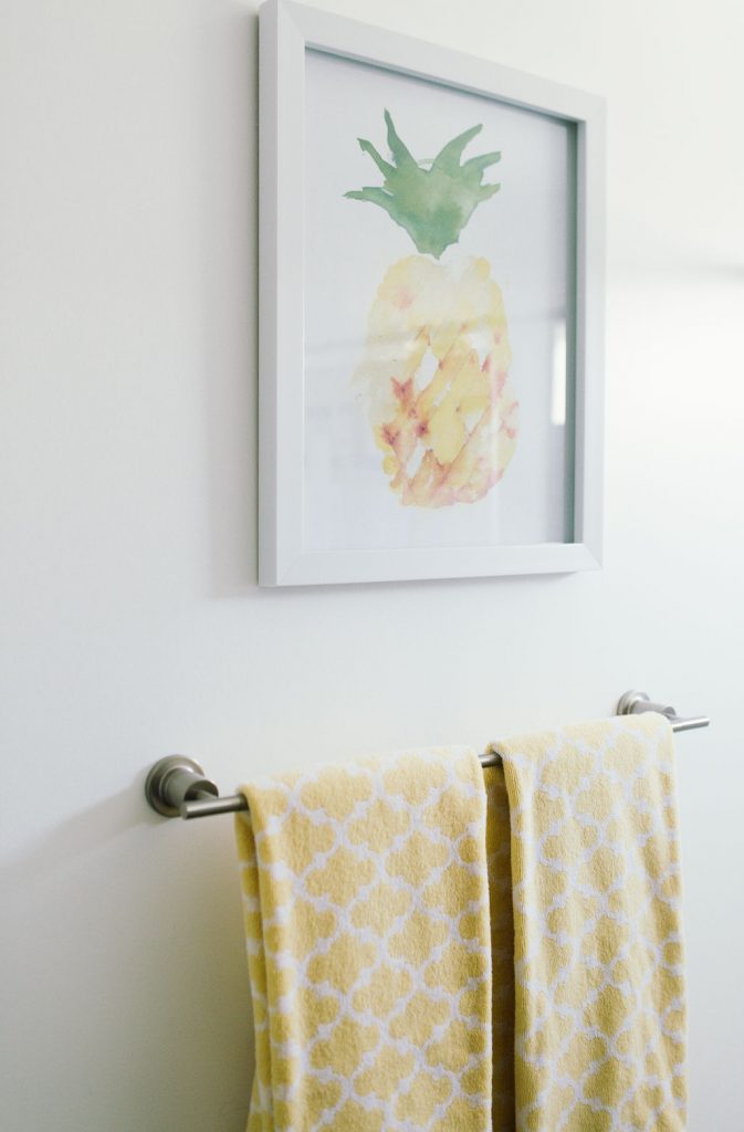
Towel bar is from Pfister.
[show_shopthepost_widget id=”3698499″]
Master Bedroom –
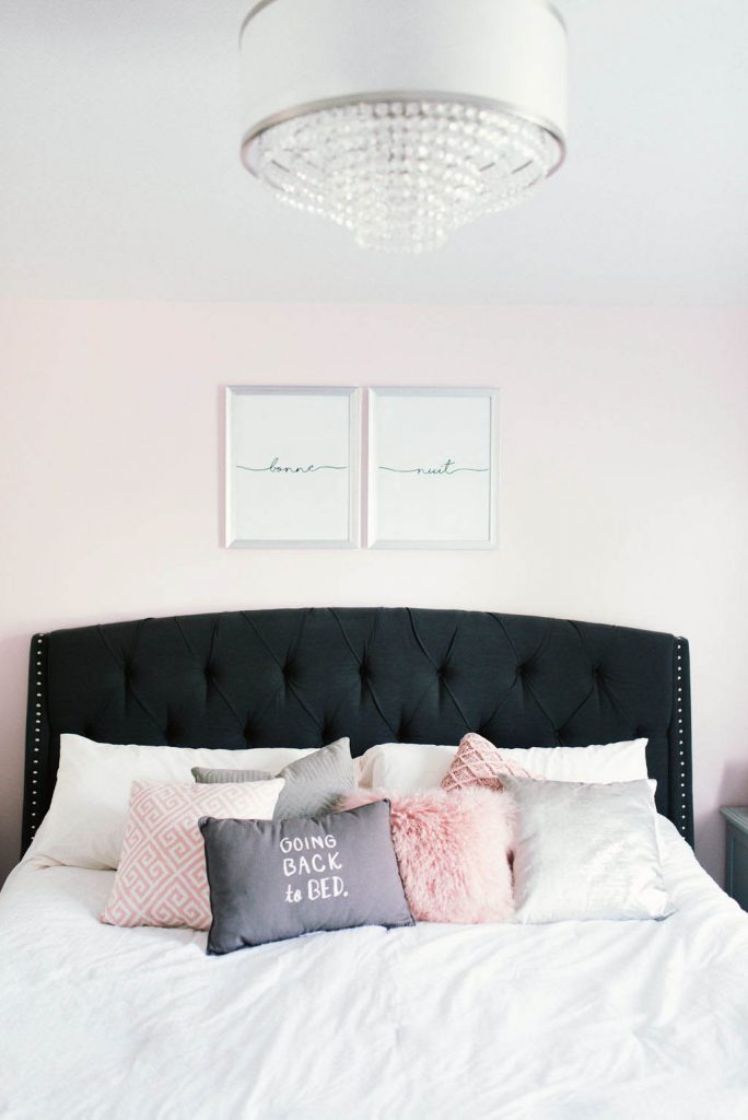 I wanted my master bedroom to be a bit more feminine, so I picked out a subtle shade of pink for the wall behind my bed, called Charming Pink from Sherwin-Williams.
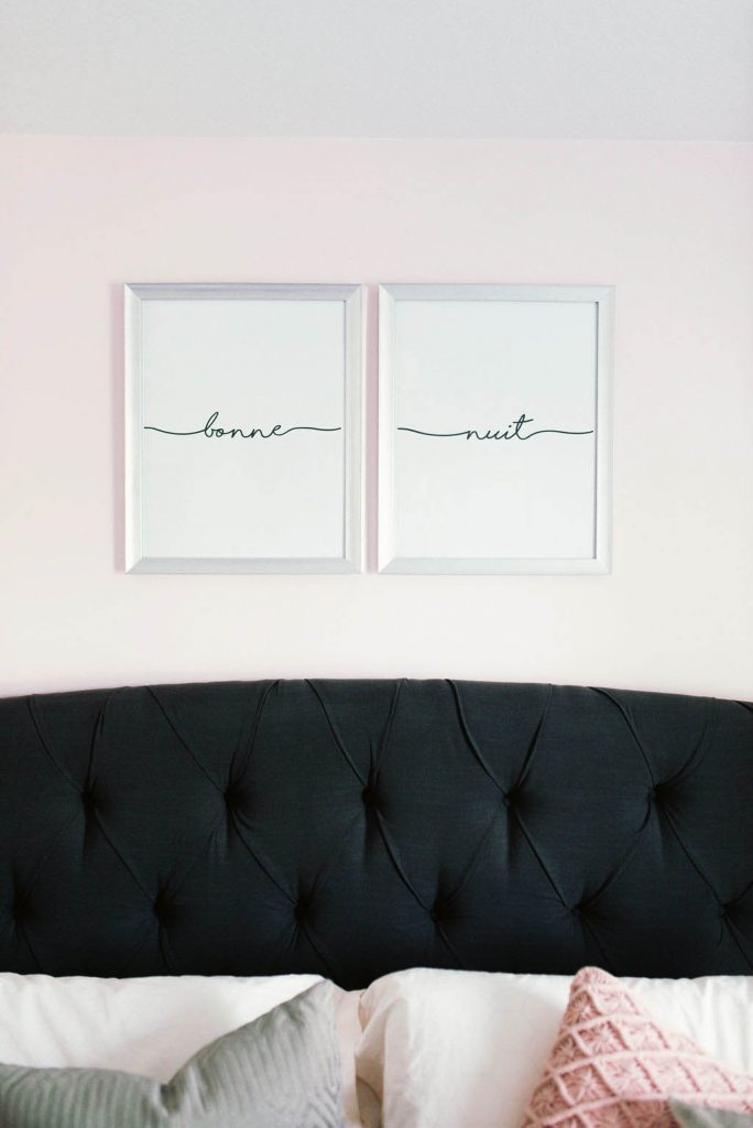 “Bonne Nuit” means good night in french, which is definitely fitting for my master bedroom, and I loved the simplicity of this print I purchased from Etsy.
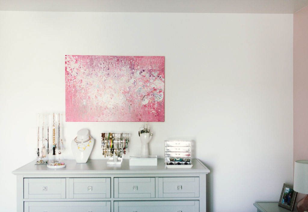 I don’t usually wear a lot of jewelry and I especially don’t wear it if I can’t see what I have, so finding a way to display it was an important part of the bedroom design. I found some great display pieces on Amazon that helped me organize and showcase my collection.
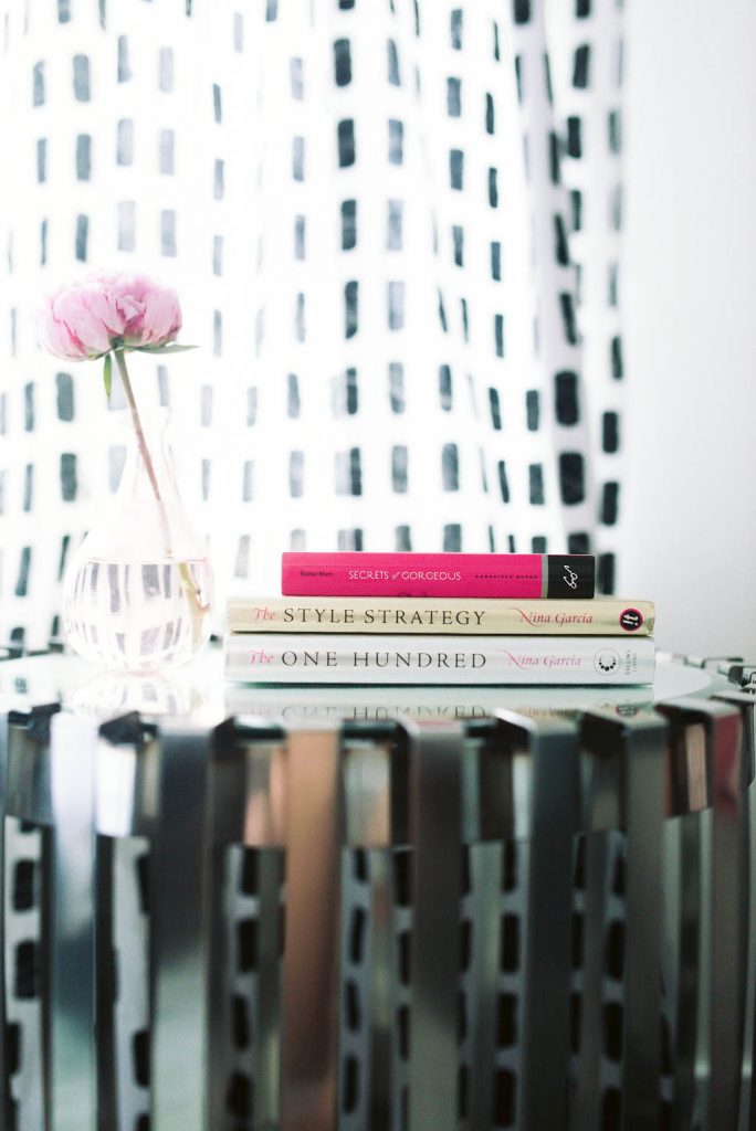
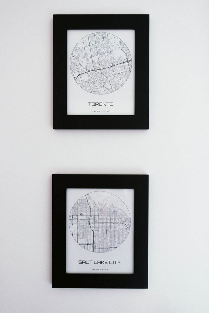 These prints are another Etsy find and add such a personal touch to my room. They are maps of the two places I’ve lived. Toronto and Salt Lake City. I’m taking these guys with me to the new house and adding a few more once I’m in Charlotte.
 Storing hats is always tricky and I didn’t want them to get ruined from being thrown around, so I picked up these hooks from Home Depot. They are the perfect size to hold each hat, without being really bulky or obtrusive. I especially love that you can’t see them!
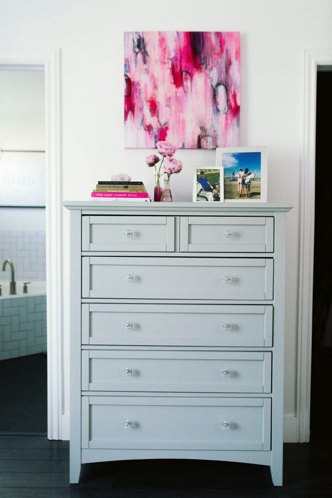 I picked out the dressers in my bedroom from All Modern. They came with drawer knobs that I didn’t love, so I worked with Ferguson to find these ones, and switched them out to fit the aesthetic of the room better.
I hung original art pieces by Carolynne Coulson and Louise Mead above both dressers.
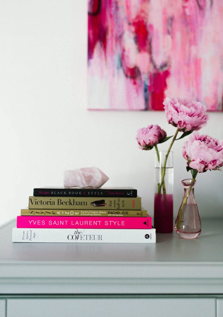
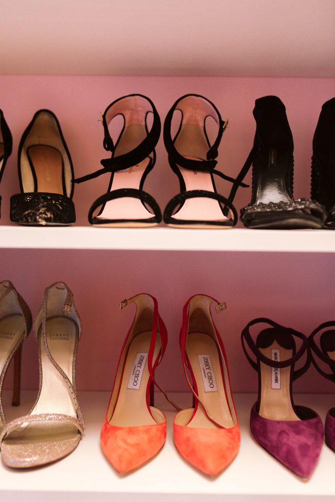 The closet is REALLY hard to photograph, because of the size, but I had a custom closet built into the space by the Closet Factory, which I LOVE. It helps me store my endless shoe collection and does it in an organized way. We also installed a sunglasses drawer, butlers hook, and a belt rack in the closet too.
I used the same Charming Pink paint from Sherwin-Williams in the closet as well. (You can see the closet and ALL of my shoes on the “My Utah House Tour” highlight on my IG stories).
[show_shopthepost_widget id=”3698530″]
Master Bathroom –
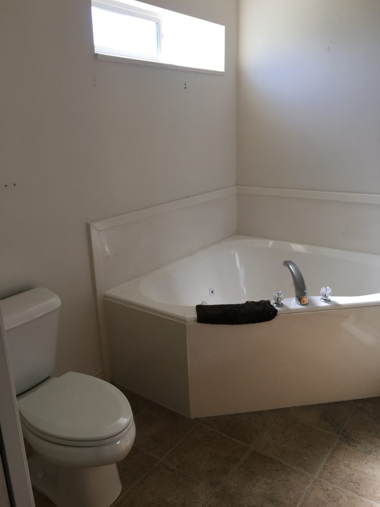
 The master bathroom was another area that completely changed after the remodel. That before photo is dreadful. I only made cosmetic updates to the space, but it feels like a totally different room.
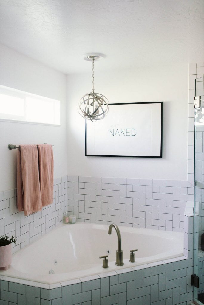 I continued the same tile and pattern from the spare bathroom into the master bathroom, using the Bedrosians Traditions Ice White 3×6 subway tiles.
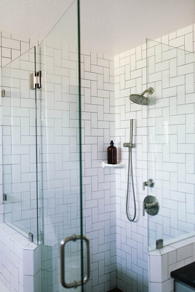 I changed out the shower to a European glass surround, and picked out this shower head and added a hand shower too.
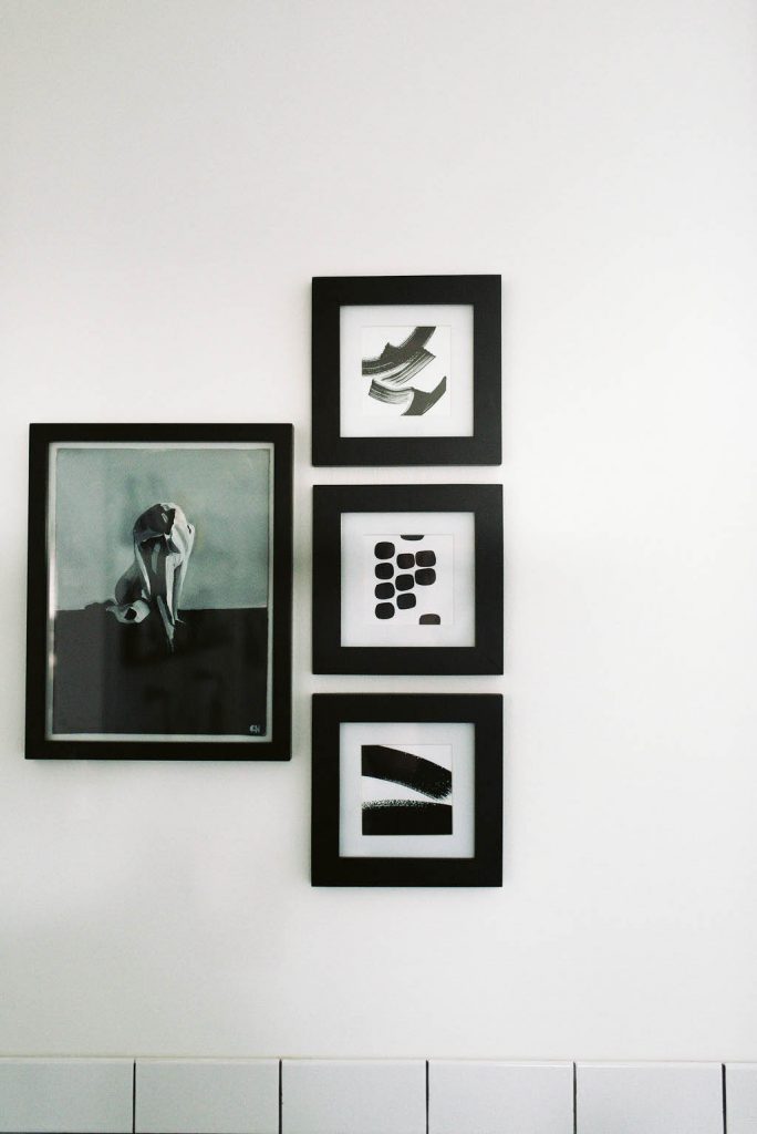 This original painting is by Clayton Hosmann and the other prints were an Etsy find.
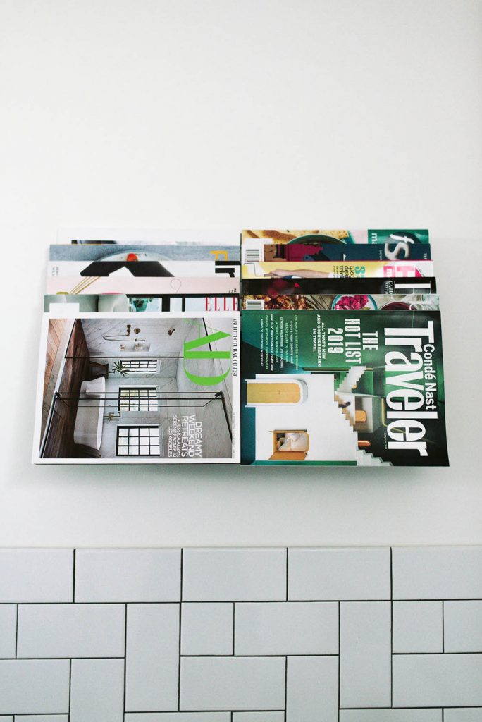 I feel like you’re either team bathroom magazines or not, and obviously, I am. I found a sleek wall rack that I love, because it’s inconspicuous and displays the magazines in a modern way which feels more like art.
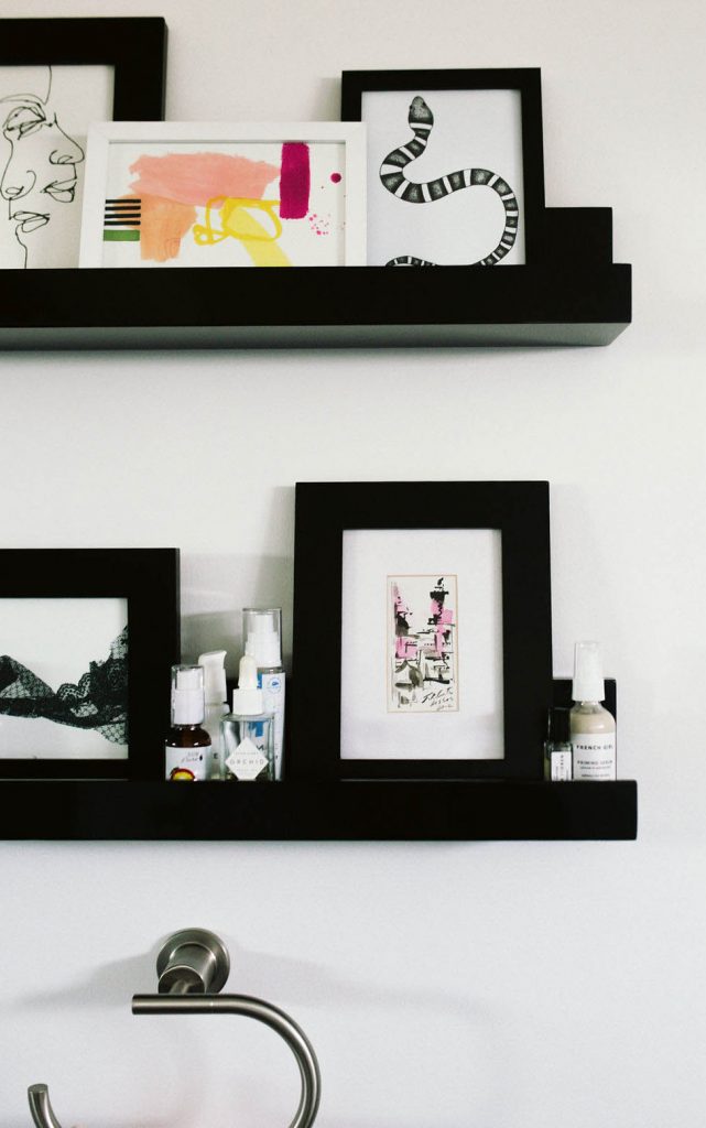
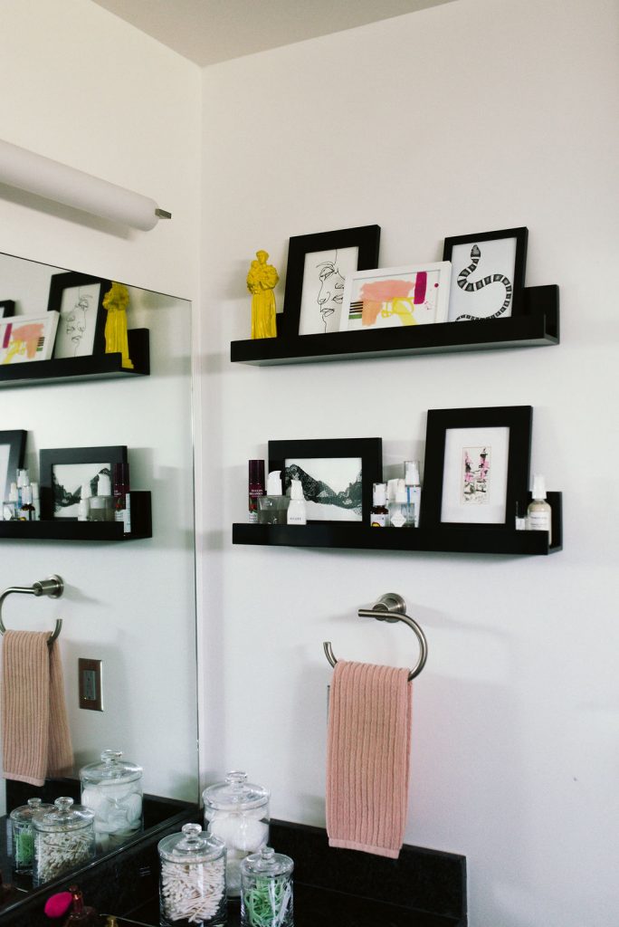 Black wall shelves add a graphic pop to the bathroom and give me a stylish place to store my face serums and lotions. I added some artwork to make them feel intentional and the yellow statue is from a trip to Portugal.
The light fixture is George Kovacs. Towel bars are Pfister.
[show_shopthepost_widget id=”3698492″]
Laundry Room –
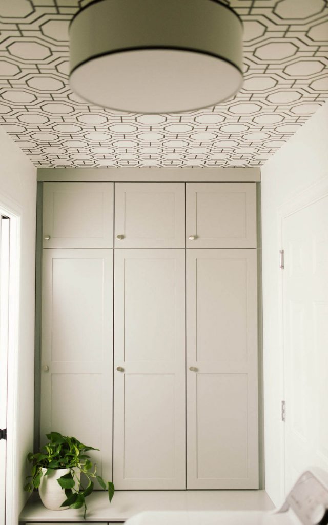 Once again, I worked with the Closet Factory to create a custom built in unit for the laundry room. Before, this space was open and wasn’t really functional. All of my laundry products were out on an open shelf and just looked messy and unorganized. When I was planning the renovation, I knew I wanted to add something that was great for storage, but also pretty to look at.
I use it to store all of my laundry essentials, plus things like paper towels, toilet paper, and tissues. It hides all of that stuff and does it in a stylish way. I used the same knobs that I used for the cabinets in the kitchen.
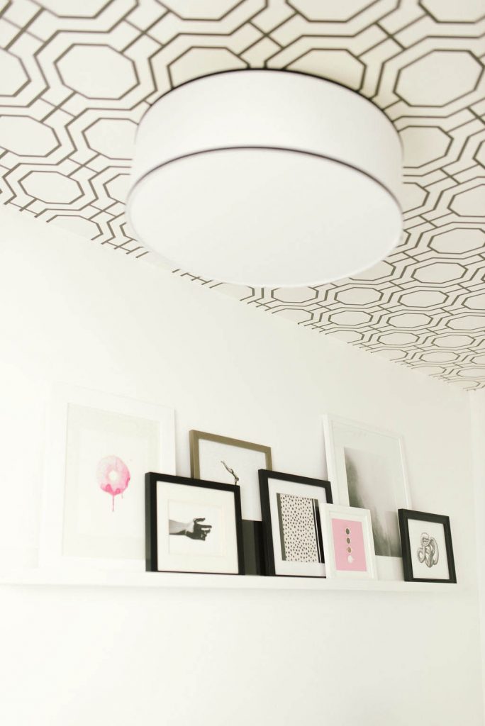 To add some interest to an otherwise boring space, I chose to add this wallpaper to the laundry room ceiling! It adds so much character to this small space and it’s always fun to see how people react when they find it.
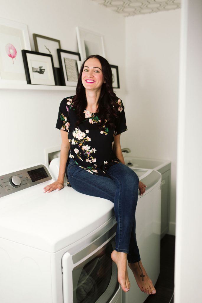
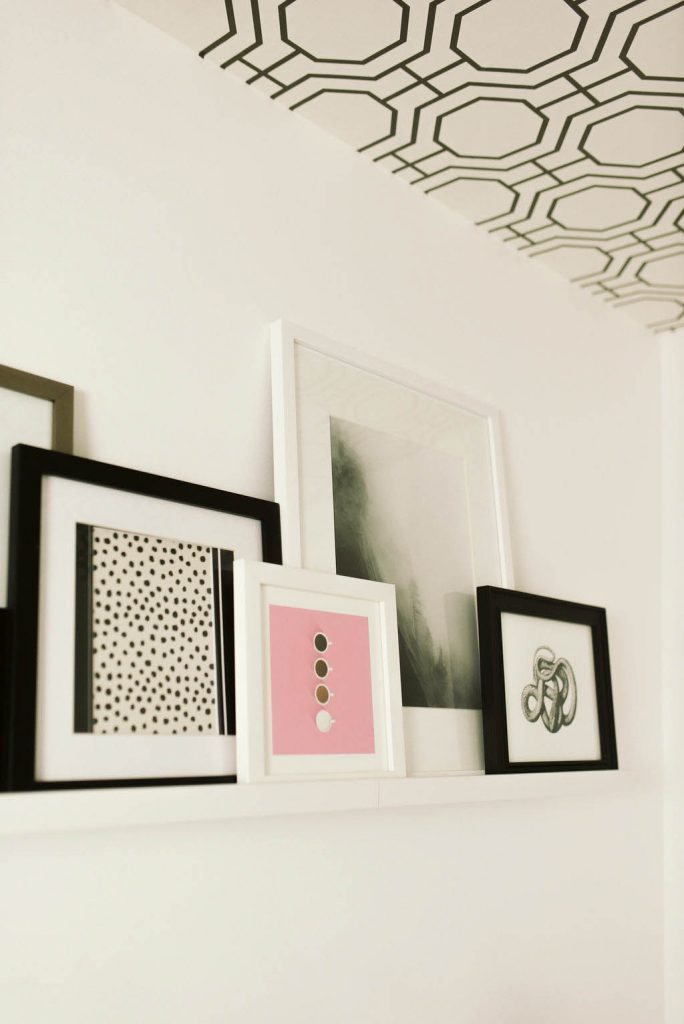 Adding some black and white prints and others with a pop of color continue the trend, that I have throughout the rest of the house.
[show_shopthepost_widget id=”3698496″]
Patio –
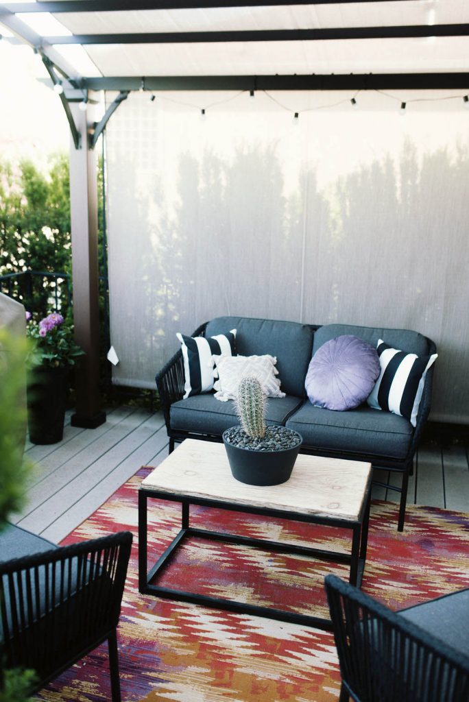
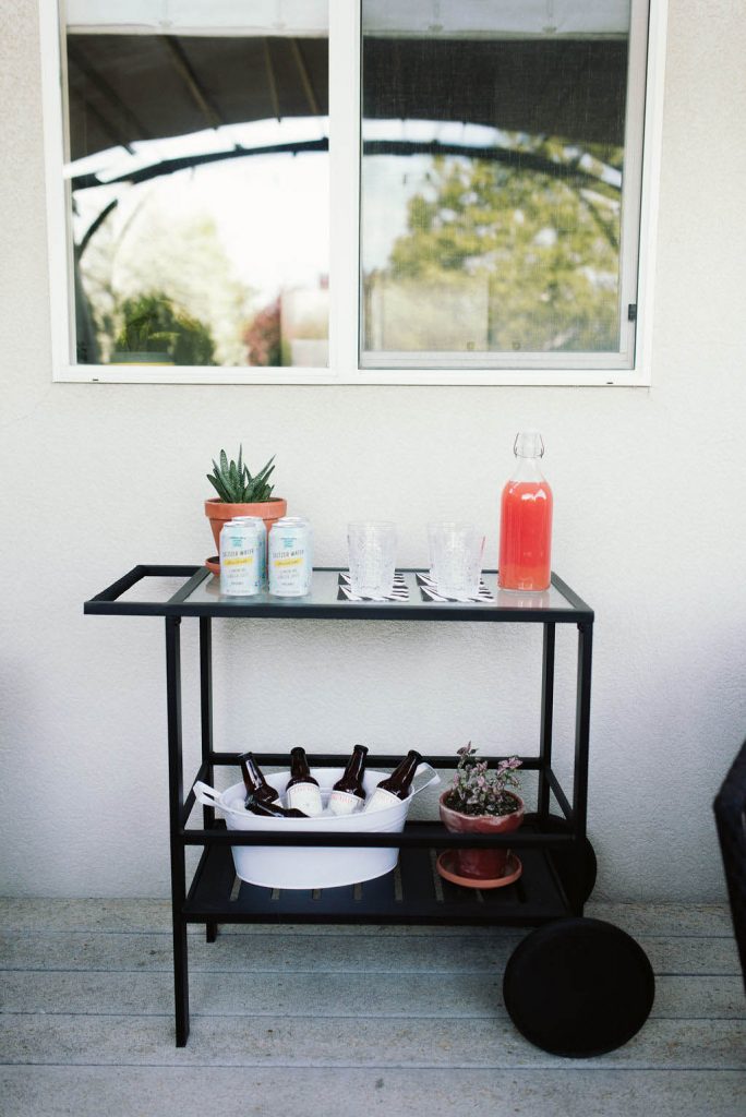
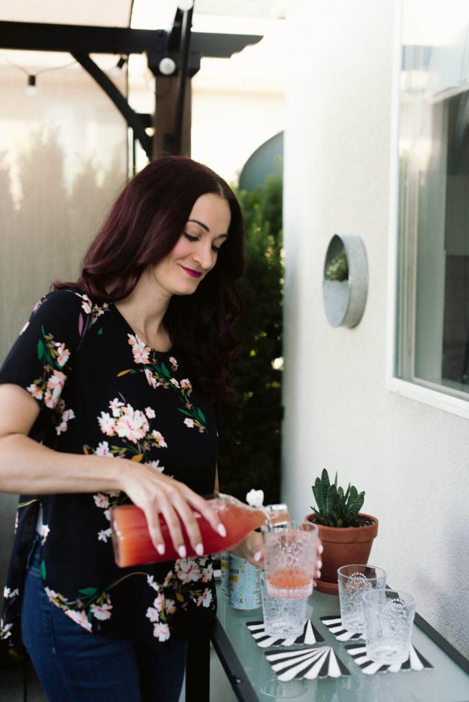
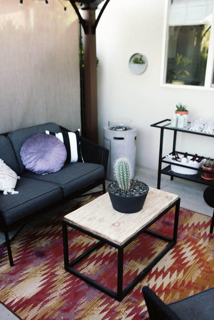 The outdoor deck in my backyard didn’t have a roof extension off of my house when I originally built it, so I installed a freestanding pergola from Lowe’s to add some shade when I’m entertaining or just relaxing outside.
The bright outdoor rug is an amazon find and the furniture is from Target. I picked out the cactus a few years ago from the garden center at Walmart for less than $15!

[show_shopthepost_widget id=”3698511″]
Well guys…that was a REALLY long post, but I hope you enjoyed my Utah house tour and hope if gave you a little peek into my style and personality. If you want more of an in depth look at the house, you can walk through my Utah house tour over on instagram stories with me under the “My Utah House Tour” highlights tab!
This little project of mine has been so fun to work on and I’ve loved living in this space. I can only hope that the new owners love this house as much as I have! Now it’s time to pack and get ready to start all over in Charlotte, North Carolina. I can’t wait to tackle a new design project and one that’s bigger too! I’ll be sharing all of the new house construction updates along the way, so make sure to follow along with me here on the blog and on Instagram!
